C.A.R.P. Health 360A Medical Records Hub for Seniors
7 min read
7 min read
Increasing membership sign up and product usage has been a core goal of the Health 360 team since its app launched in 2018. Due to less than desired results, the team decided that there was a need to change its marketing approach to its senior members in Canada. In addition to redesigning the app, the marketing website also needed to be redesigned to give users access to more product information as well as to serve as the Health 360 app login portal.
My Role
UI redesign, discovery and ideation, user research, prototyping and design handoff
The Company and The Product
The C.A.R.P. Health 360 app is a digital medical records hub for C.A.R.P. members provided by C.A.R.P. It is offered as a complementary membership benefit and it allows users to store, retrieve and access all their health records in one place.
Most of its features, i.e record storage, retrieval and access, are free however, there are two services that are offered for a fee through the platform.
- Record Retrieval Concierge – Health 360 collects and stores all medical records from clinics, doctors and hospitals for the member
- Instant Health and Wellness Support – 24/7 phone access to Canadian nurses at the disposal of the member
In addition to having access to the app, each member receives a medical emergency card that allows emergency medical teams to quickly gain access to the individual’s records in case of an emergency.
The Problem
Despite having a solid understanding about the product market fit, the Health 360 team faced an uphill battle engaging members to sign up for the product from the beginning.
The platform lacked having a consistent marketing plan and had constant changes in the leadership team since its launch compounded to the lack of product direction.
Through early reporting and user interviews, it was discovered that:
- Most C.A.R.P. members were not aware that the Health 360 app existed and that it was included with their membership benefits
- Only a small fraction of the 150,000 C.A.R.P. members have signed up and actively use the platform
- Members who know about the Health 360 app were not clear on what features and services were offered through the app
The Process
After learning about the product and the problems from stakeholders, I performed an audit on the marketing website to get a first hand look on the existing issues. Then, I thought we needed to talk to potential members, first and foremost, to get a general idea about how they perceived the product and the marketing website.
Based on this premise, the process took place in the following manner (from left to right starting at the top):
Create Proto Personas and a Journey Map
Create proto personas and a journey map based on the preliminary research data provided by the CARP Health 360 team
Conduct User Research
Interview users to better understand their perception of the product and the marketing website
User Research Analysis and Findings
Analyze user interview findings and deliver recommendations to guide the design
Design Solutions
Based on the business requirements and user research findings, explore various solutions through sketches, and then refine the design through wireframes and mockups
Validate Design Solutions
Validate the new information architecture and the designs through gorilla user testing
Finalize Designs
Based on the gorilla user research, finalize the designs and create a project style guide and component library for the developers
Design Handoff
Present the project style guide to developers, work closely with them to answer any design related questions or issues that arise during development, QA the website to ensure that it adheres to the project's functional and visual specs
Gain Insights through Data
Leverage Google Analytics to gain insights on potential user experience issues and create a roadmap for future iterations
Proto Personas and Journey Map
The impetus to create proto personas and a journey map came from not having a clear understanding of our users in the beginning of the project.
Both artifacts served as the project’s north star throughout the design process as well as a visual roadmap to get stakeholder buy in at different project checkpoints.
Lastly, it provided a high level picture of how and when our members engaged with Health 360 from the time they learned about the product to the time they used it.
Because there are only two use cases for the app, users were grouped into two main cohorts:
- C.A.R.P. members who were 55+ and needed to use the product in the event of a medical emergency
- C.A.R.P. members who were 55+ and needed to use the product to access their medical records during a non medical emergency, i.e doctor’s appointment
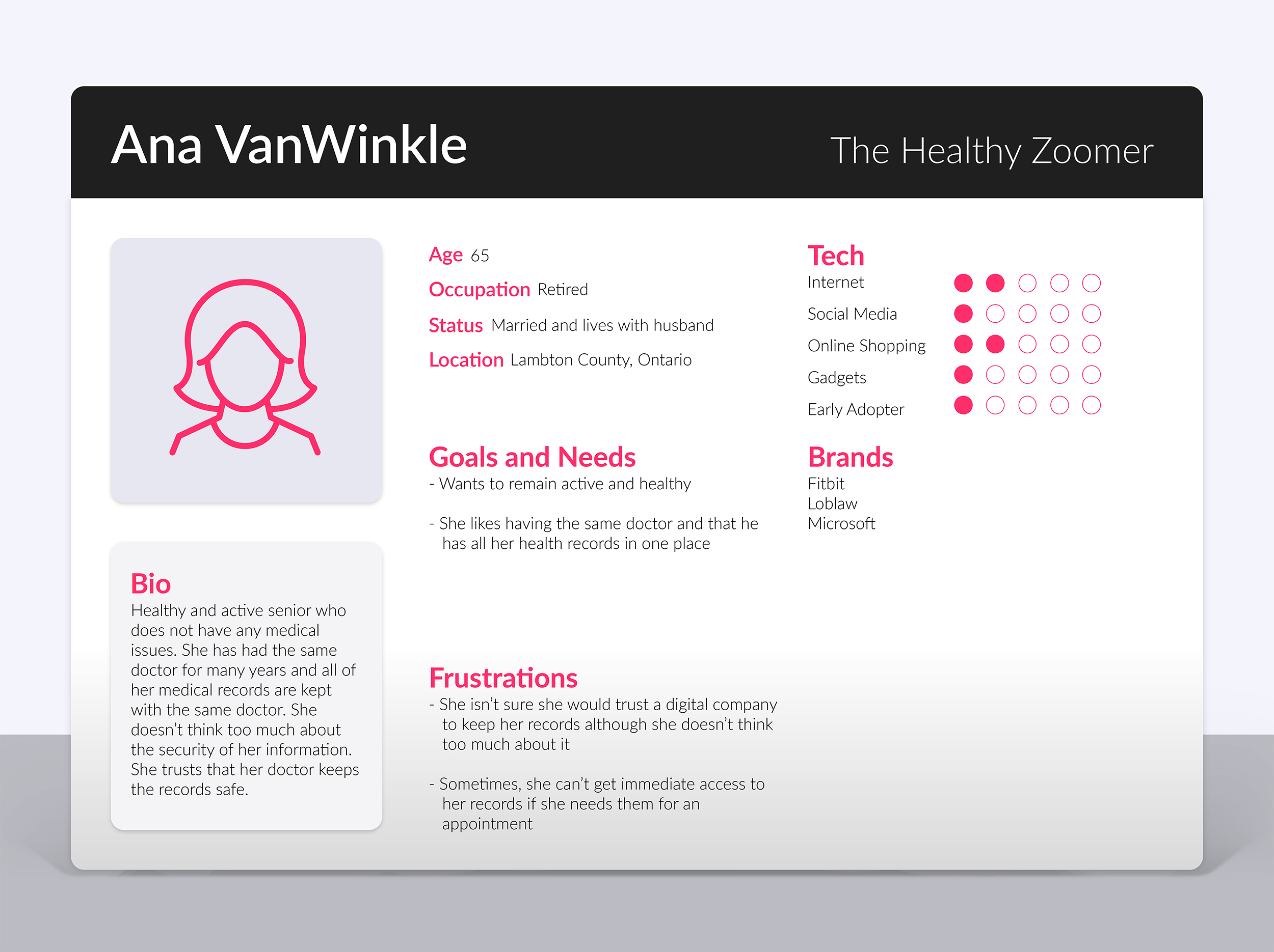
Based on the information above, the following two proto personas were created:
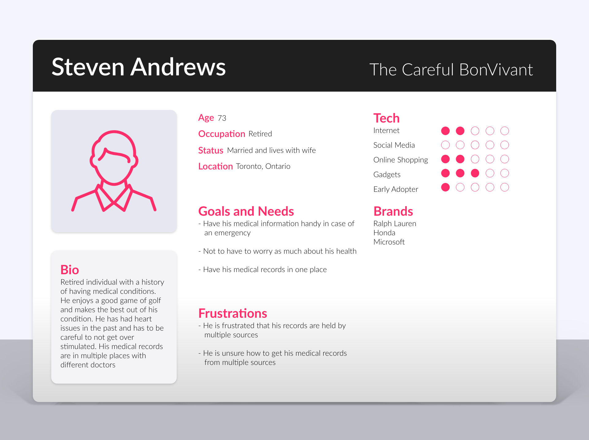
Steven “The Careful Bon Vivant”
This persona represents users who have pre existing medical conditions and are concerned about their health. They are the ones who are most likely to have a medical emergency and would like to keep their medical records in one place.
Ana “The healthy zoomer”
This persona represents users who are healthy and are not very concerned with any eminent health issues. They are the ones who mostly use the app to access medical information during doctor’s appointments.
Journey Map
In addition to the proto personas, I wanted to have a broader understanding of the steps a user takes from the moment they learn about Health 360 to the moment they use the product.
It outlined the stages, steps, emotions and opportunities involved in the entire Health 360 user journey.
After creating it, it was immediately clear to the team that the marketing site experience lacked content to clearly explain this journey.
More specifically, we could improve on three stages of the journey.
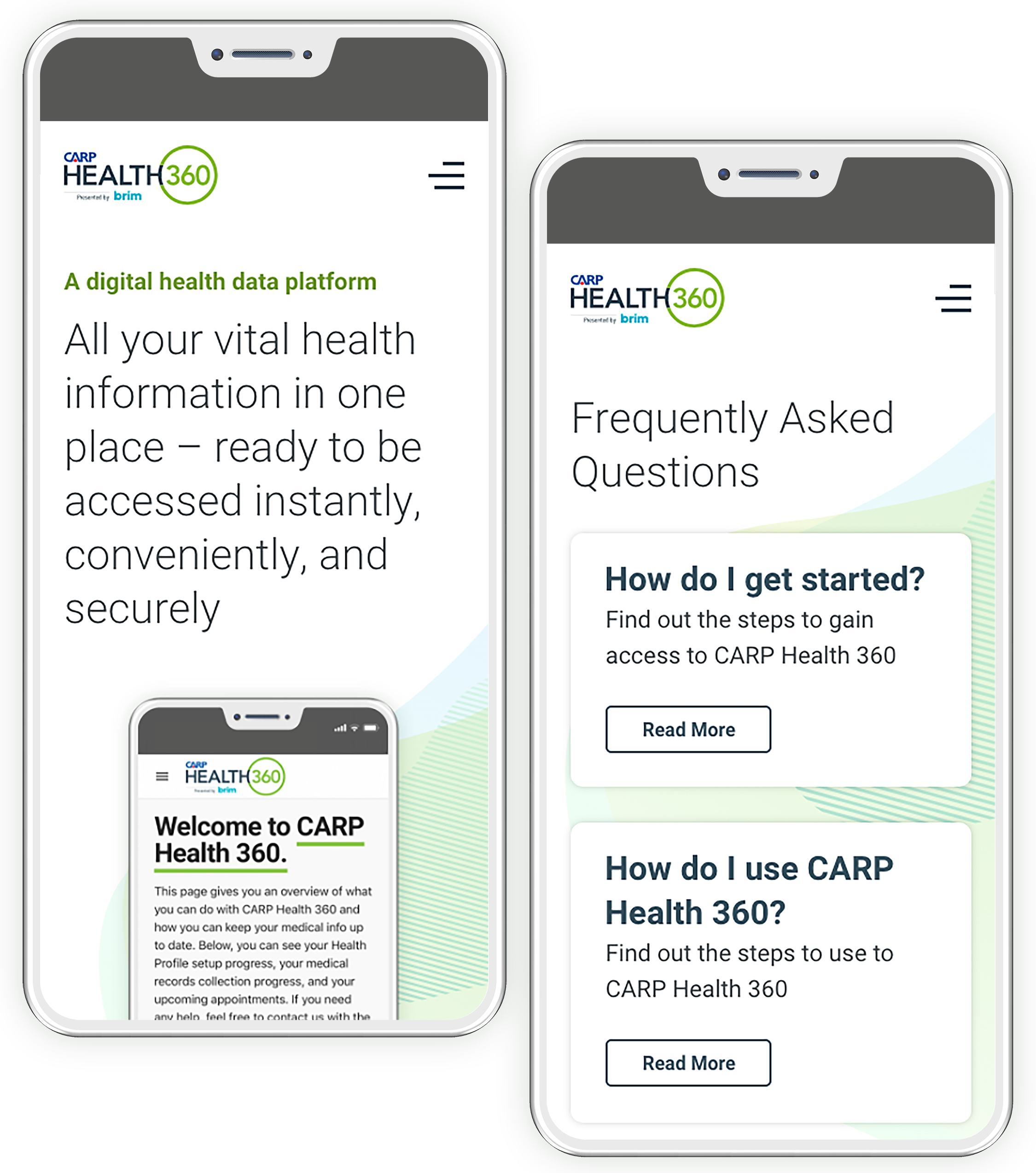
- Member Sign In or Sign Up – Once a new user arrived on the landing page, there was very little information about how one could access the platform. Non members had to sign up to C.A.R.P. first and then sign in to Health 360. The lack of clear information about the process was apparent and we realized that this issue needed to be rectified on the new site iteration to improve the sign up/sign in process.
- Fill Profile and Gather Records – Users could do it by themselves or pay a fee to have Health 360 do it for them however, the old site did not address this process. This finding was especially important because gathering records is an additional revenue stream for the product.
- Access Records – Users access their medical records on the app for two reasons: during a medical emergency or during a non medical emergency, i.e doctor’s appointment. The old site had little information about this and the team thought this should be emphasized in the new site iteration.
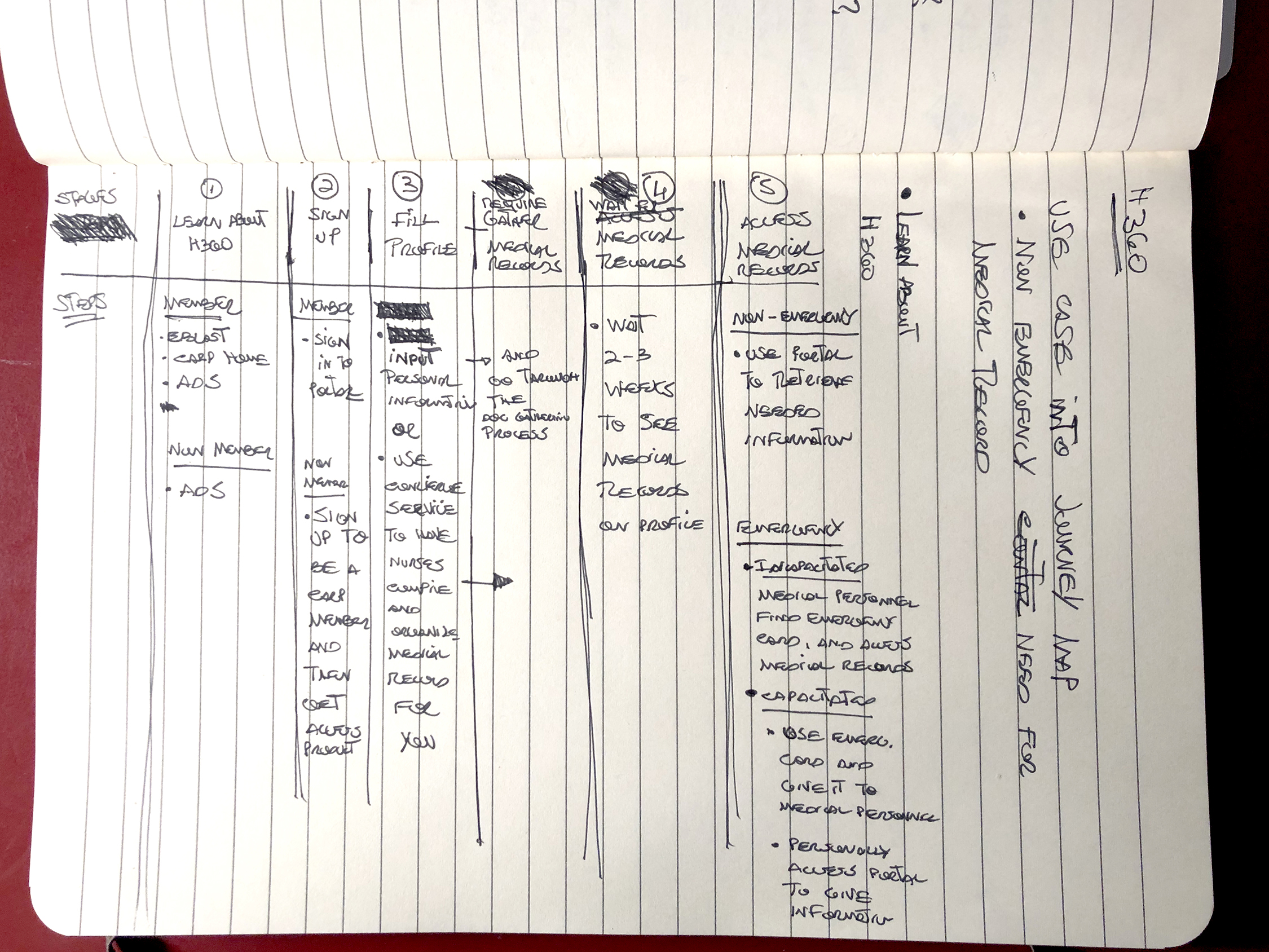
Initial journey map Sketch
Before creating the initial journey map, this sketch was quickly validated twice by stakeholders to ensure that all of the steps and stages were captured.
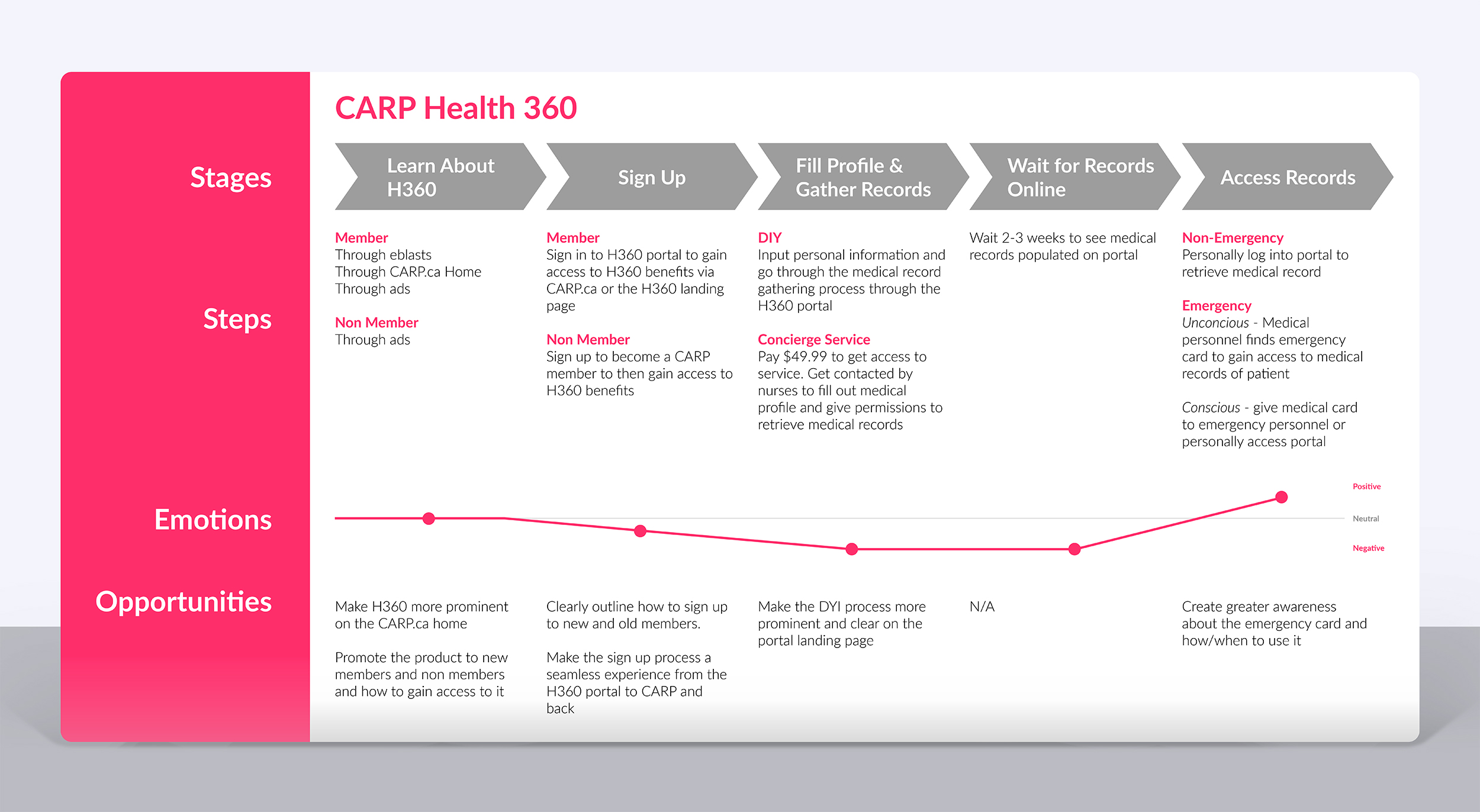
Health 360 journey map
The journey map diagram served as a visual guide for the entire H360 process from discovery to product use. it also allowed us to get buy in from stakeholders during various project checkpoints and ensure that the final design aligned with the overall product journey.
User Research Part I – User Interviews
To better understand the user perception of the marketing website, I recruited and interviewed 5 seniors between the ages of 60 and 74 to participate in a mediated study via Zoom.
Goal of Study
Understand current user perception about the Health 360 product as well as uncover the most prominent issues related to the marketing website experience and content.
Methodology
One-on-one 45 minute long user interviews via Zoom. Users were asked to visit the Health 360 website and browse through it. Once done, I asked them a number of questions related to that experience.
Participants & Recruitment Criteria
The study had 5 participants and it was open to any individual who was 55 years and older and were not familiar with C.A.R.P. Health 360.

What Was Asked?
A number of open ended questions were asked to probe their thinking about the product offering, the digital experience and the content.
- Can you explain what this website is about?
- Can you explain what features and benefits stem from this product?
- Would you sign up and use this product? Why?
- What would you add or take away from this site?
Study Findings
- All participants were able to explain the service and product at a high level
- None of the participants were able to clearly elaborate on product features or benefits
- 4 out of 5 participants voiced concerns about the security of their data on the platform
- 1 out of 5 participants would sign up and use the service
Design Recommendations
Based on the findings, the team decided that the new website design should, first and foremost, tell a clear story about the product. Users needed to be able to clearly understand what the product offering was to make an educated decision.
With that, the four pillars of the design phase were:
- Deliver a simple user experience with clear and structured content
- Tell a story about what the product is about, how to use it, when to use it
- Prominently showcase features and benefits
- Add a privacy and security section to the landing page to address privacy concerns
User Research Part II – Closed Card Sort
After the user interviews, I started to work on initial sketches as well as on an updated information architecture for the site.
Knowing that the new site map would be similar to the previous, I came up with an initial information architecture based on the the type of information we would want to highlight to address user concerns.
To validate the initial idea, I created a closed card sort study using Optimal Workshop.
Goal of Study
Validate updated website information architecture
Methodology
Each participant was given a link to access the card sort study on Optimal Workshop and were asked to complete it within 2 days.
Participants & Recruitment Criteria
Sent the Optimal Workshop card sort link to 10 senior ZoomerMedia employees who were not involved in the Health 360 project.
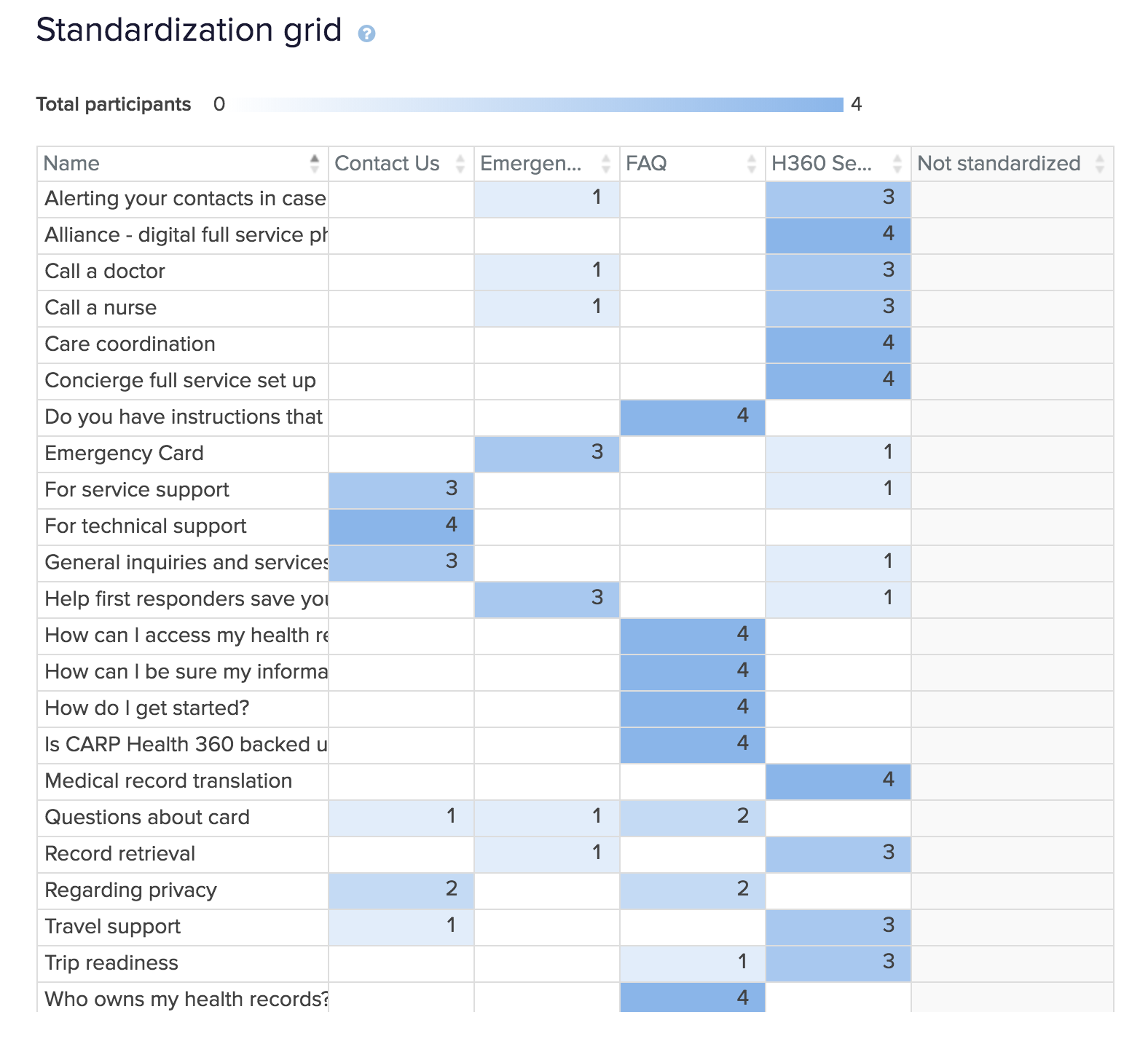
Initial Navigation labels
- Health 360 Services
- Emergency Card
- FAQ
- Contact Us
Study Findings
Despite the fact that most participants were able to properly place the items in the right buckets, we only had 4 participants complete the study. With that, I decided that the findings were not concrete enough to support the design and because of time constraints, I had to move forward with the proposed information architecture.
Recommendations
Design a new card sort study with new participants before the project moves onto development.
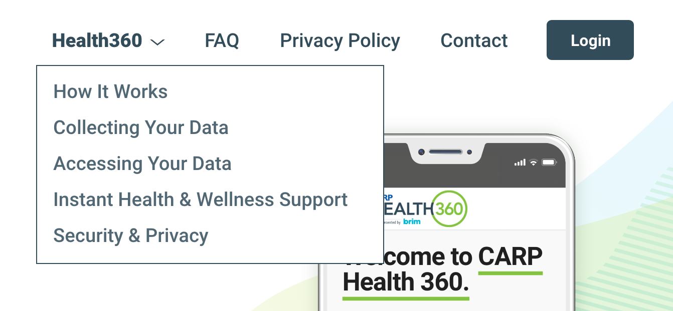
IA Changes
After presenting the study findings to the team, we ended up having to change the information architecture to accommodate a new content structure as requested by the most senior stakeholder.
In order to keep all of the product content on one screen, the senior stakeholder suggested to eliminate all secondary screens besides FAQ and Contact Us. This was a great idea for many reasons but it would create a new problem for us. It would make the landing page very deep and it would require users to scroll down below the fold to see a lot of essential content.
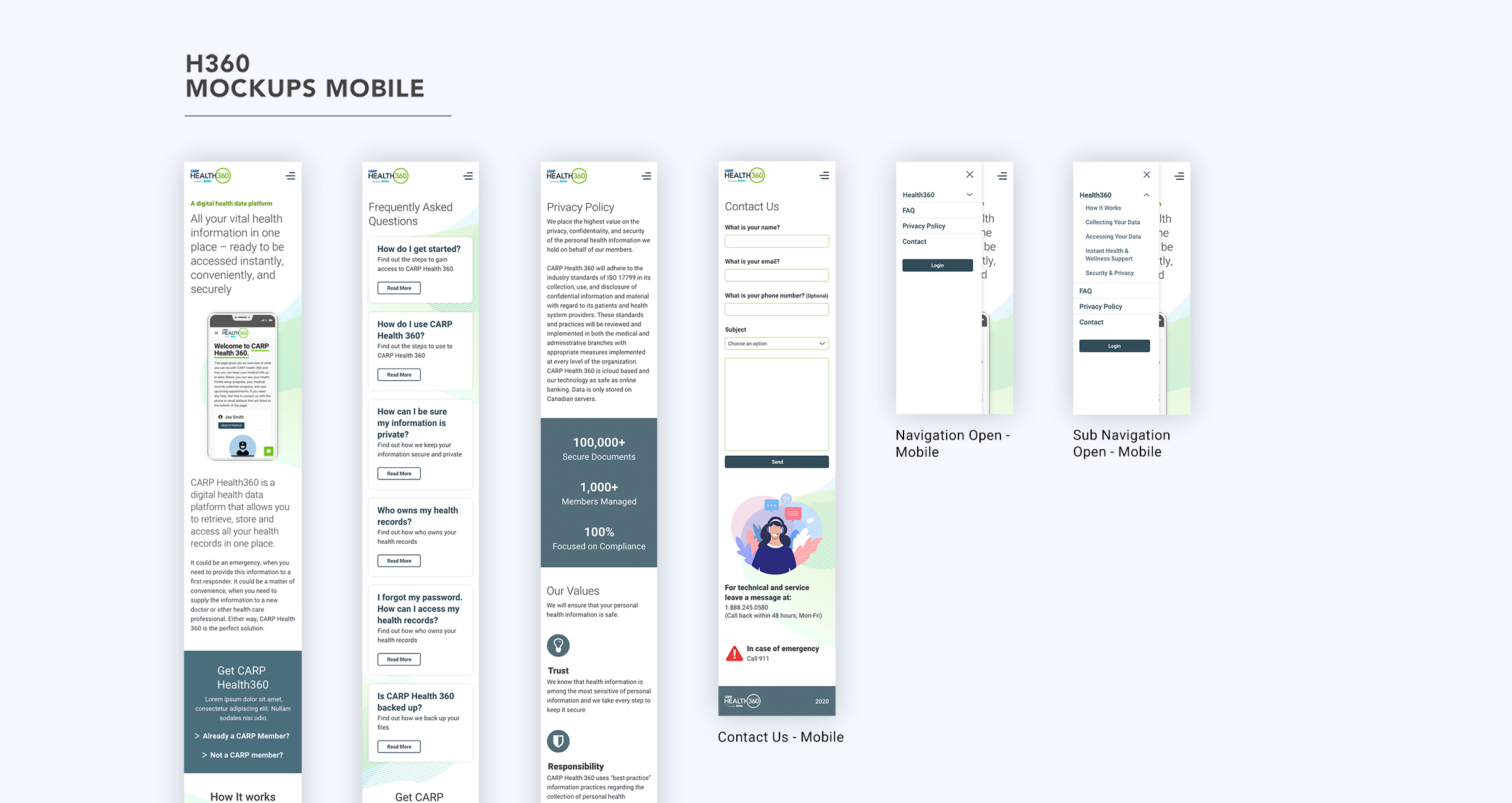
How could we address this issue and still allow the user to find all of the content from the navigation? A simple and effective solution was to add a sub navigation under Health 360 with each section name. Once clicked, the browser would scroll to that specific anchor point on the landing page.
In addition to the sub navigation under Health 360, I thought it would be important to also feature “Privacy Policy” on the navigation to address user concerns about the topic.
Before arriving at the approved information architecture showcased on the right, I ended up going through two different iterations (not shown).
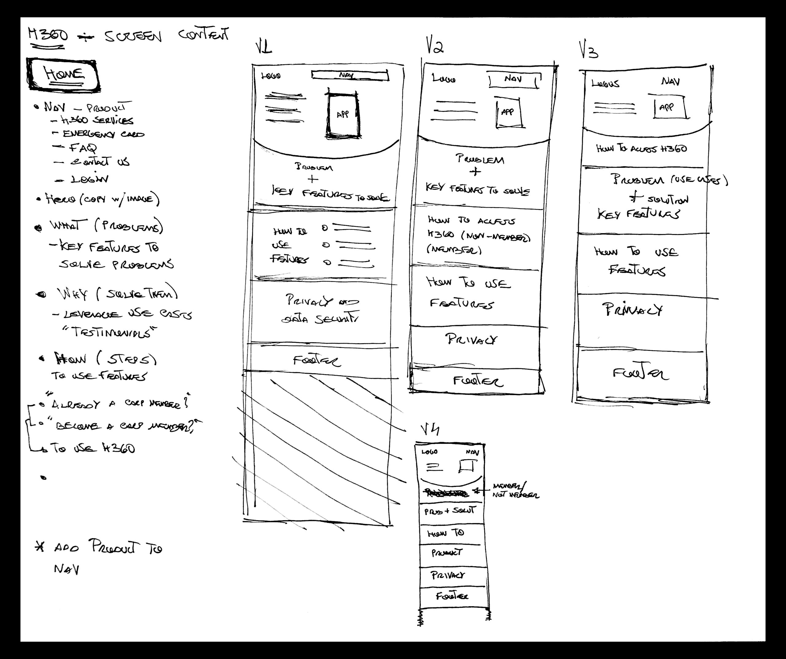
Design Solutions – Sketches, Wireframes and MockUps
Initial Information Architecture and Home Screen Ideation
While keeping in mind the design recommendations, this was the very first pass I took at how the information architecture would be structured and how the content would be laid out on the home page.
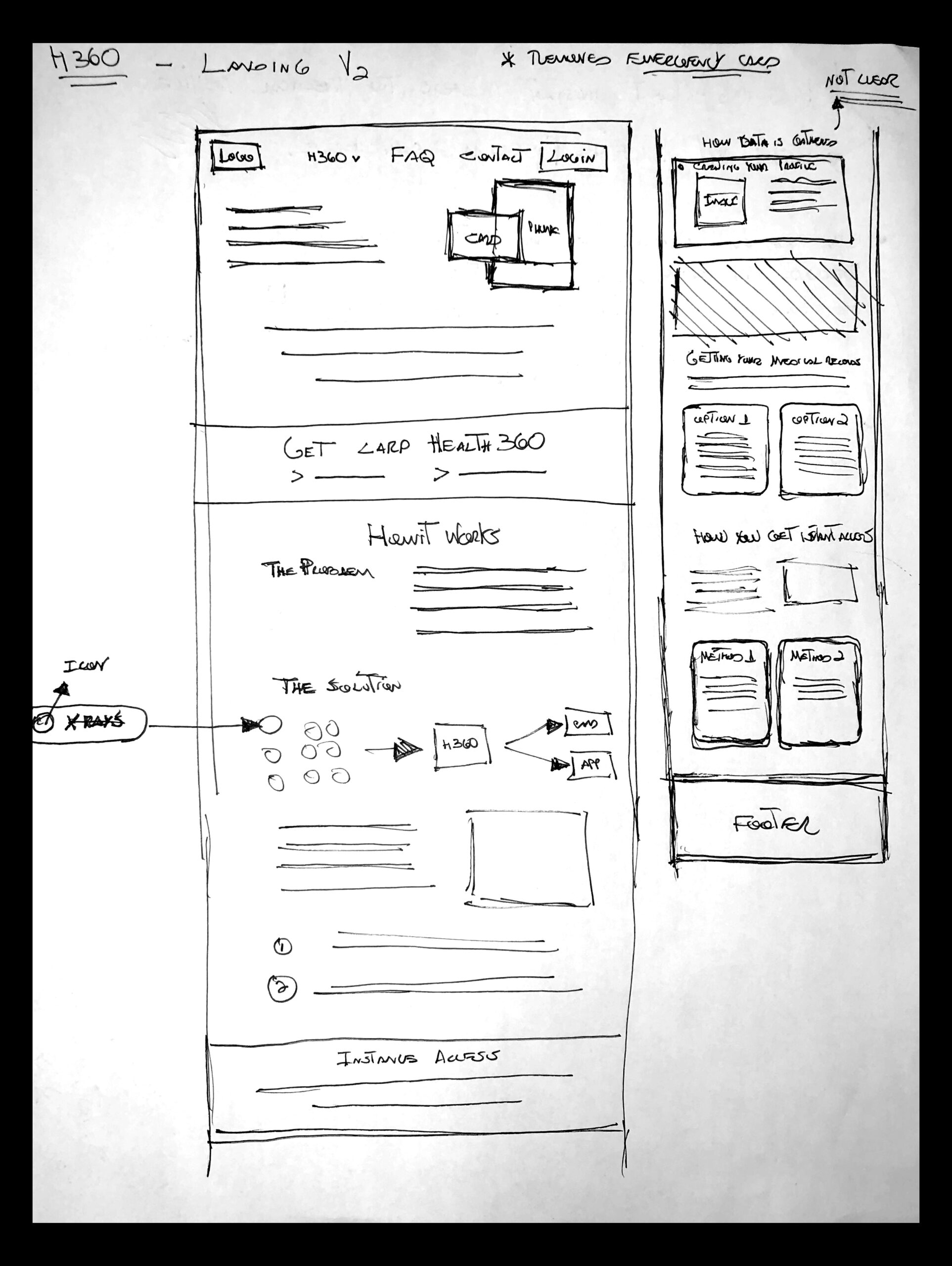
Home Screen Sketch V2
After gathering quick feedback from a couple stakeholders on the initial sketches, I refined the home screen and added more detail to each component before moving on to wireframes. This process also took place for all of the website screens.
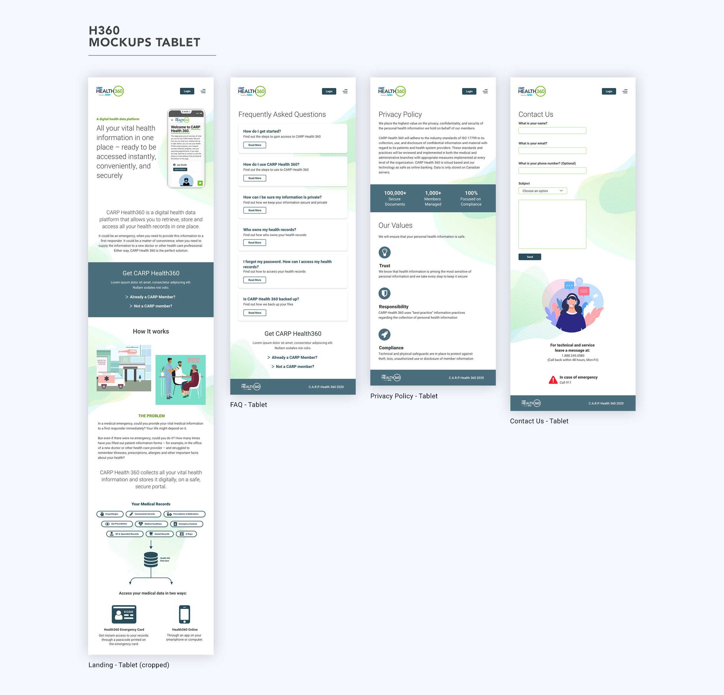
Wireframes and MockUps
Once I worked through all of the screen sketches, I created simple wireframes to present to all of the stakeholders.
The initial iteration (Wireframes V1 below) had the landing page structured in the following manner:
- What is the product
- Product main features
- The problem
- The solution
- When to use Health 360
- Health 360 services
- Information Privacy & Safety
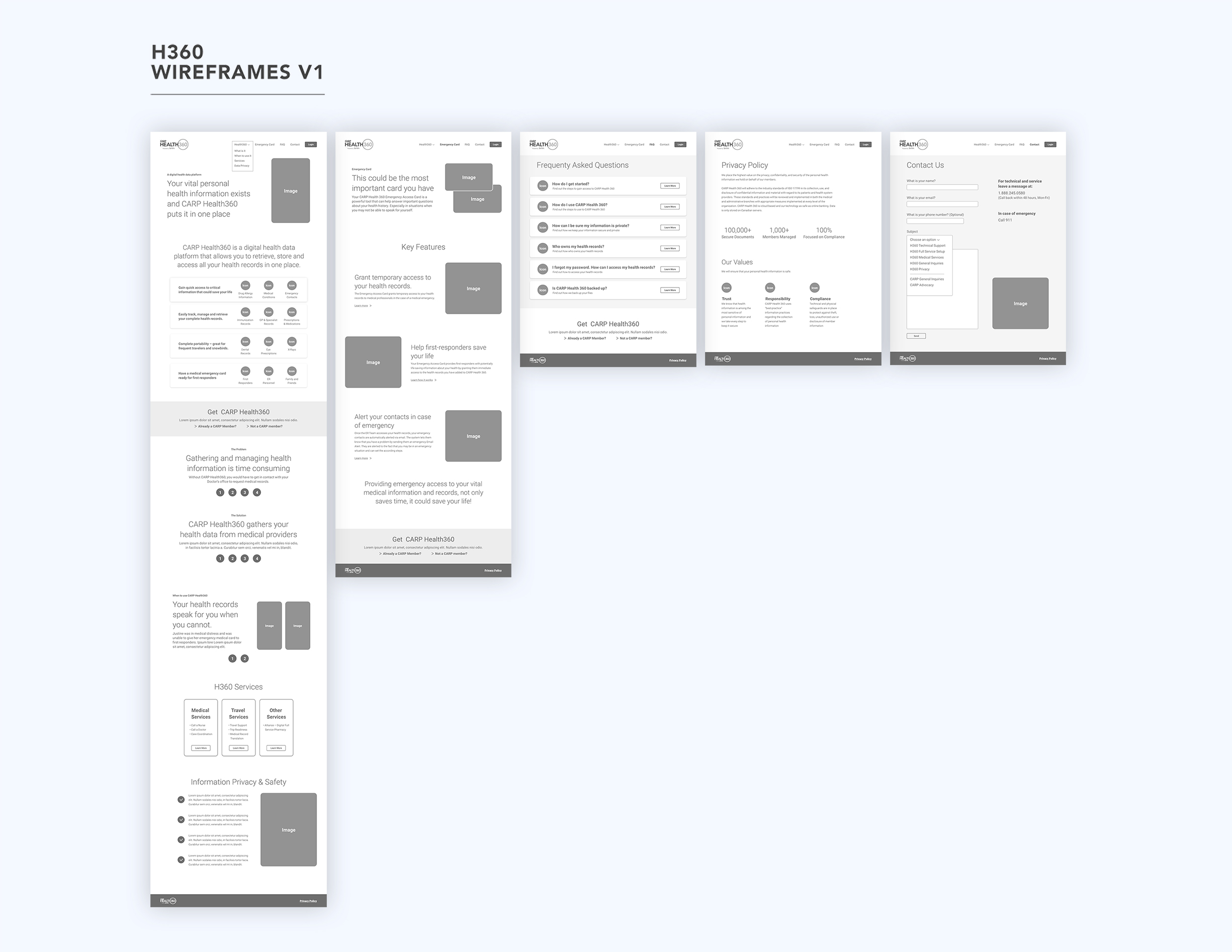
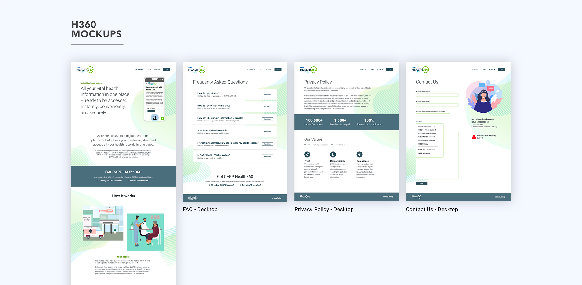
Screens shown above from left to right:
Landing page, Emergency Card, FAQ, Privacy Policy, Contact Us
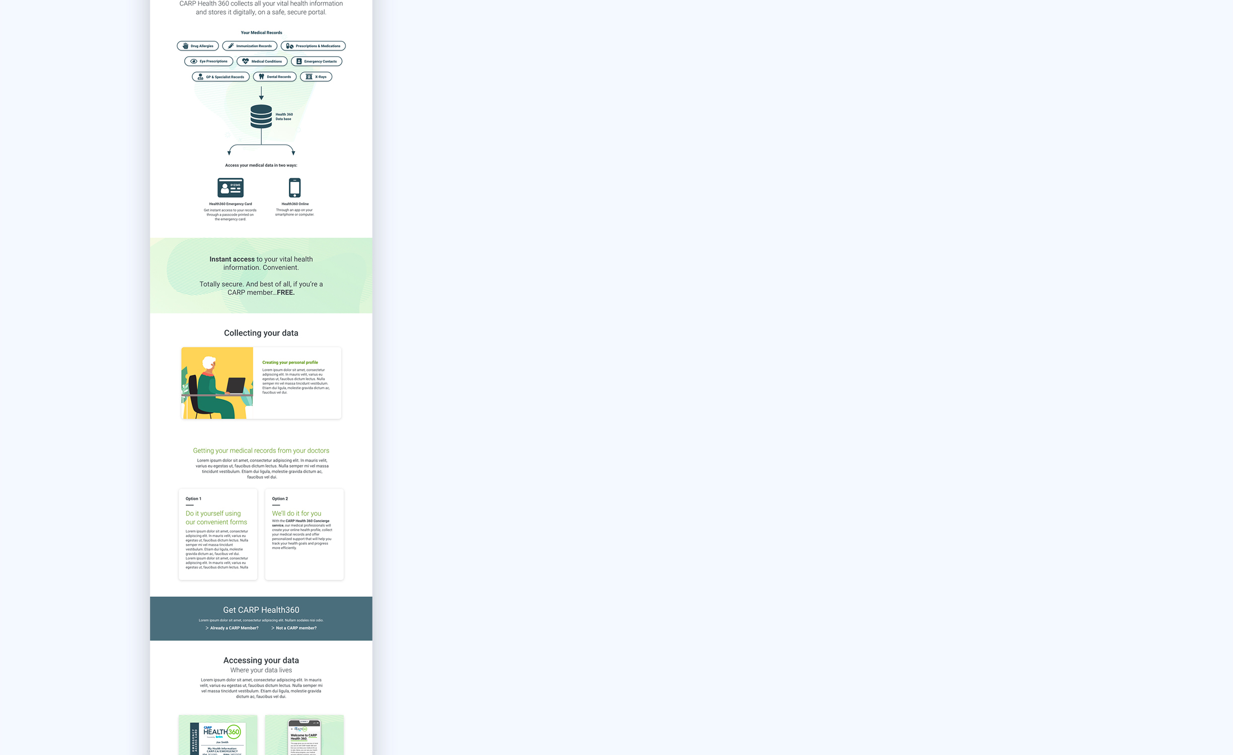
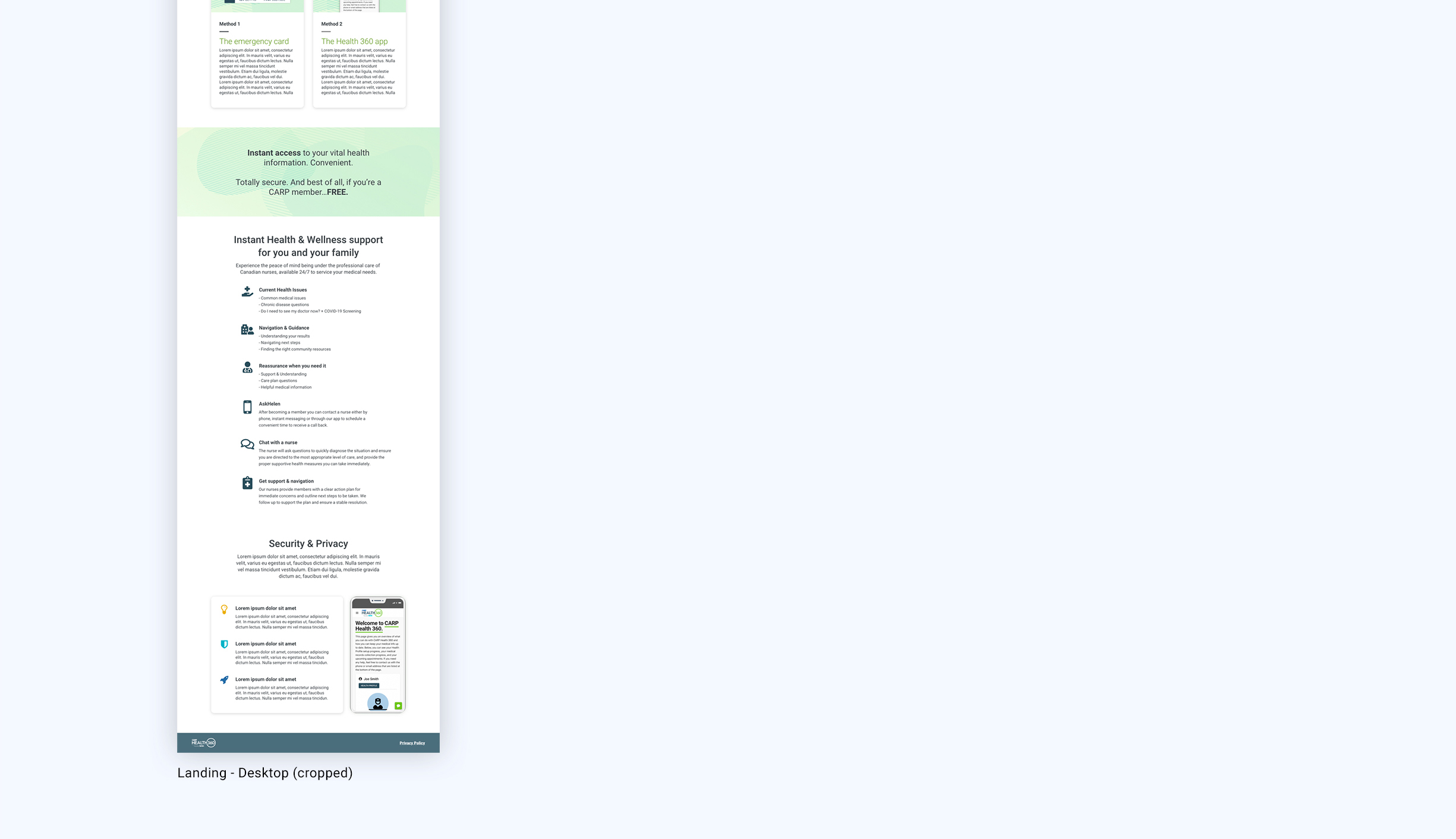
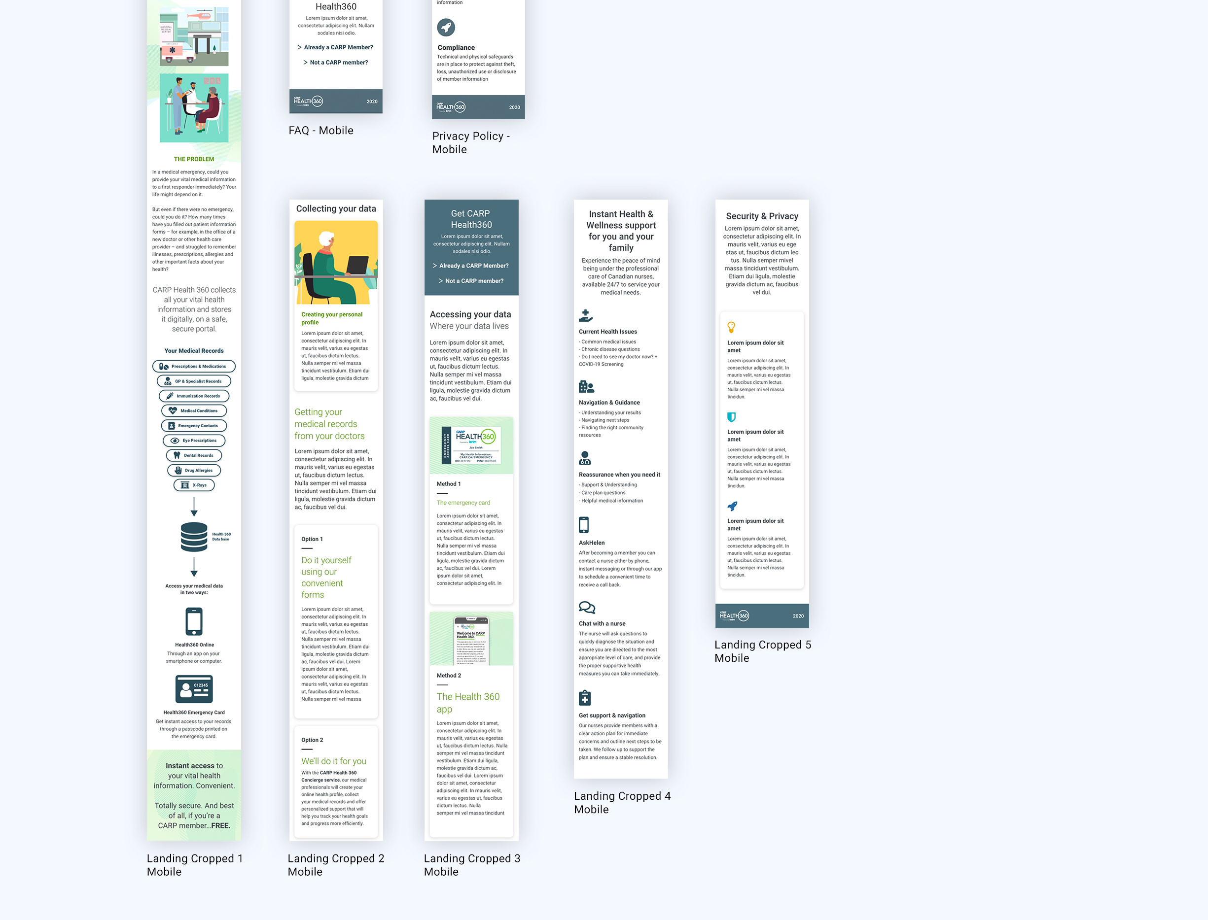
Once the wireframes were presented, the main stakeholder proposed a different landing page structure. The concern was with the order in which I had placed the content. He thought that the position of the product features would take away from trying to tell a what, how and when story to the user. To solve this, I moved the feature section to the bottom of the landing page just above “Security & Privacy”. The new structure ended up like this:
- What is Health 360
- How it works
- Collecting your data
- Accessing your data
- Product features
- Security and privacy
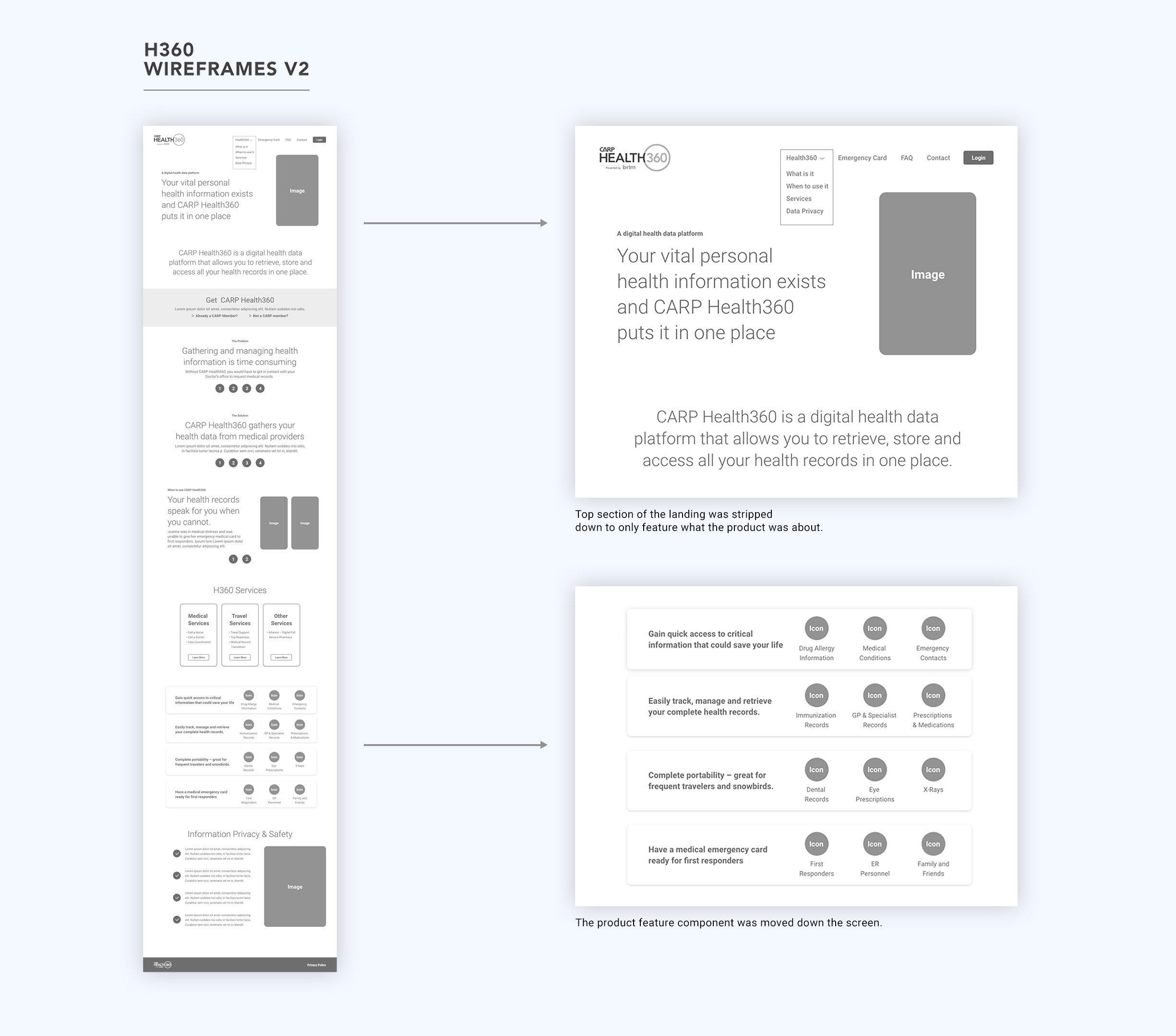
Only the landing page was modified on the second version of the wireframes.
The second landing page iteration seemed to convey the product story in a more linear fashion compared to the initial iteration.
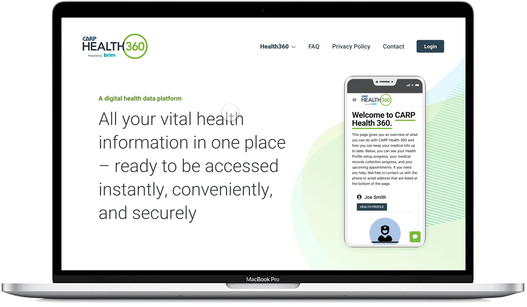
Once the wireframes were approved by the stakeholders, I had moved on to high fidelity mockups without much user testing due to time constraints. Visually, the idea was to design a clean and visually pleasing layout that would allow the content to shine. The colour palette and illustrations were derived from the app for consistency.
Interactive Prototype
In addition to mockups, I created an interactive prototype for a few reasons:
- Present a more realistic experience of what the site would look and behave like to stakeholders and developers
- Guide developers through micro interactions and specific component behaviours
- Test and validate design with users
Outcome and What is Next?
This was a great project to work on as it provided an opportunity for me to lead the end to end design process of a struggling product. The real learning and value came in the form of adjusting to the ever evolving priorities of the project. I had to be flexible to adjust the process along the way in order to stay in line with stakeholder requirements.
If I were to change something about the process I used, I would conduct more user testing to validate the information architecture and the final design iteration.
It is my plan now to benchmark and compare the new site versus the old through Google Analytics. The hope is that we will be able to measure the site performance to be able to further improve it in the future.