C.A.R.P. & Brim Financial Financial Rewards Program
11 min read
11 min read
In fall 2019, C.A.R.P. and Brim Financial partnered to launch a financial rewards program targeting seniors 55+. The initiative strengthened C.A.R.P.’s membership value proposition while expanding Brim Financial’s market reach. I contributed to an integrated digital platform that streamlined credit card applications and membership conversions, delivering mutual value for both organizations.
My Role
Lead designer – end to end process: discovery, requirements, user research, UI design, design handoff, QA testing and developer support through launch
The Companies
C.A.R.P. is Canada’s largest advocacy association for older Canadians with 150,000 members, promoting healthcare access and financial security through exclusive member benefits.
Brim Financial is a Toronto-based credit card issuer (founded 2015) offering three Mastercard tiers tailored to diverse customer needs.

The Product
The C.A.R.P. × Brim Financial Rewards program combined a credit card with a mobile-first app that functioned as both an eShop and finance tracker. Members accessed partner discounts, earned reward points, and redeemed them for cash or purchases—all through a seamless digital experience that positioned it as a digital-first financial product.
The Problem
The partnership launched with critical unknowns:
- Would C.A.R.P. members adopt a new credit card when seniors typically show strong loyalty to existing financial products?
We needed to validate product-market fit and understand member perceptions before designing the digital experience.
The Process
To validate the concept, I conducted comprehensive user research to understand the product, rewards program, and target audience. My process included:
Stakeholder Discovery
Analyzed program requirements and stakeholder objectives to align business goals with user needs.
Qualitative & Quantitative Research
Conducted focus groups and surveys to assess user perceptions of credit cards and rewards programs within the 55+ demographic.
Analyze Focus Group and Survey Data
Synthesized research insights into a strategic roadmap spanning design, content, and marketing initiatives.
Conversion Funnel Design
Designed multiple user flow variations, evaluated conversion impact, and presented recommendations to stakeholders. Iterated based on business priorities and technical constraints.
Design Execution
Translated research insights and technical constraints into wireframes and high-fidelity mockups.
Design Validation
Validated design solutions through user testing and iterated based on feedback.
Handoff & Implementation Support
Created style guide and component specifications for development, then conducted ongoing QA to ensure functional and visual consistency throughout implementation.
Data-Driven Insights
Leveraged Google Analytics and TrialFire heatmap data to identify UX friction points and prioritize feature roadmap iterations.
Our Users
C.A.R.P.’s core demographic is 55+, retired, financially stable, and primarily Ontario-based—drawn to travel and health benefits.
We identified six user scenarios across two segments (members vs. non-members), each with three distinct conversion paths:
Members:
- Applying for card only
- Applying for card + renewing membership
Non-member:
- Applying for card + joining C.A.R.P.
Research
C.A.R.P.’s extensive member data provided a strong foundation for early decision-making, allowing us to focus research on validating user perceptions rather than building personas from scratch.
To address our core questions efficiently, I facilitated focus groups and deployed surveys—scalable methods that captured diverse member perspectives within project timelines.
Focus Groups & Survey
I facilitated a focus group with 15 C.A.R.P. chapter leads and deployed a survey to 9,955 members (437 responses) to validate product-market fit and identify potential dealbreakers.
Key Findings:
- General enthusiasm with requests for clearer Brim-C.A.R.P. benefit integration
- Transparency concerns around the partnership and data privacy
- App resistance among some seniors
- Top barriers to signup: lack of interest after learning details (41%) and credit card saturation
- Most valued rewards: cashback, easy redemption, travel credits, non-expiring points
Design Implications: These insights shaped our strategy: prominently feature high-value benefits, ensure content clarity around the partnership, and design frictionless flows that prevent cognitive overload and mid-funnel drop-off.
Brim Financial KYC Audit
I audited Brim’s existing KYC flow to understand handoff points, identify content misalignment with C.A.R.P.’s brand voice, and map the end-to-end user journey.
Key Outcomes:
- Split KYC collection: Moved personal data capture (name, address, DOB, membership status, card selection) to C.A.R.P.’s flow before Brim handoff—reducing friction and maintaining brand continuity
- Step count optimization: Quantified total application steps, revealing the need to minimize C.A.R.P.-side interactions to prevent abandonment
This audit informed our architectural decisions and ensured a seamless cross-platform experience.
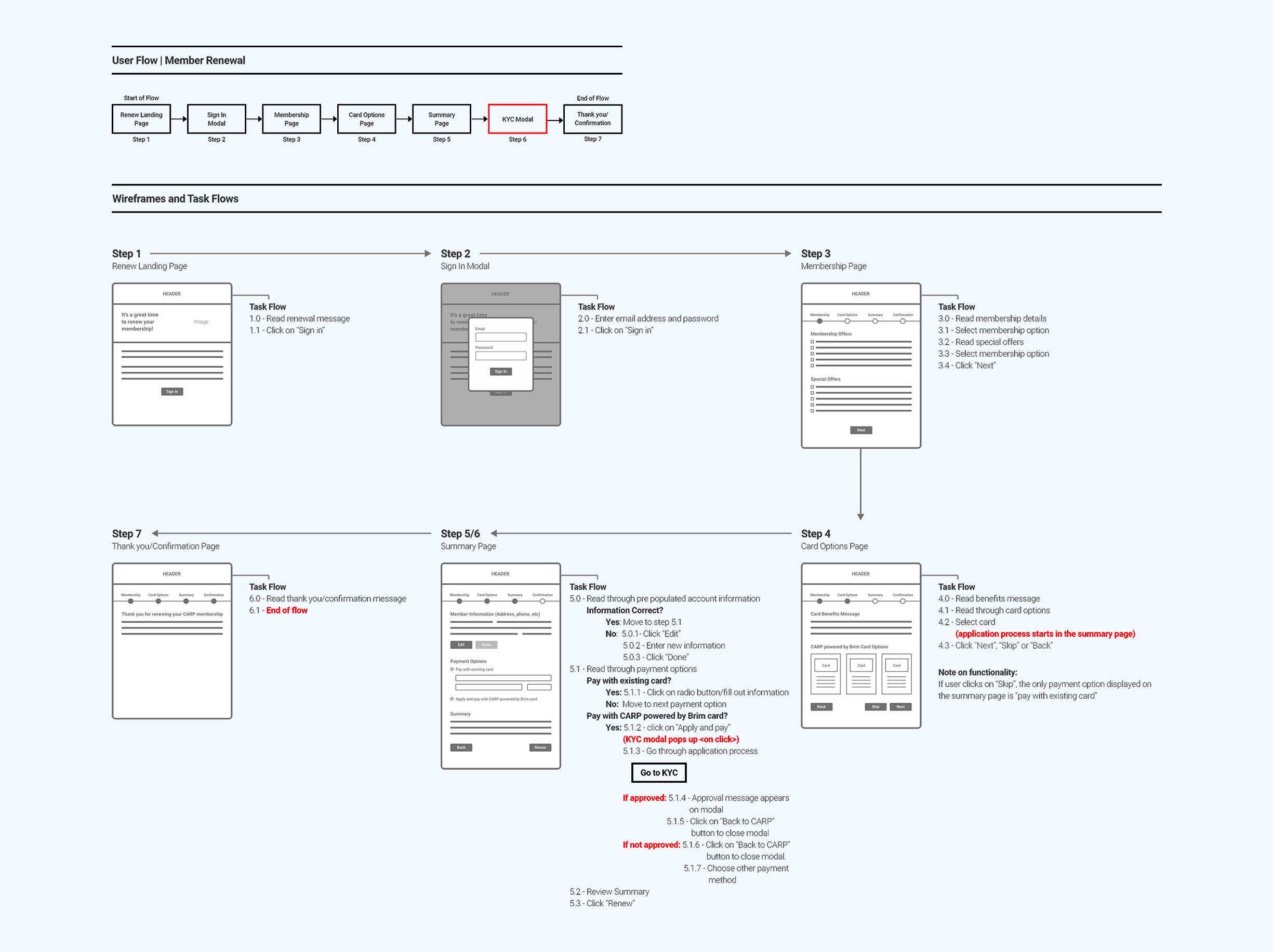
User Flows
The core challenge: users had to become C.A.R.P. members before applying for the card—requiring us to merge two high-stakes conversion flows (membership + credit application) without introducing friction.
Happy Path Considerations: User type, membership tier, card selection, and seamless C.A.R.P.-to-Brim handoff
Unhappy Path Considerations: Exit point identification and retention strategies across both platforms
Design Goals:
- Capture membership and card preference data before KYC
- Chunk information into digestible steps to reduce cognitive load
I designed multiple flow variations using swimlane diagrams that mapped organizational ownership and API endpoints—clarifying cross-platform data architecture for stakeholders and developers.
Approved User Flows
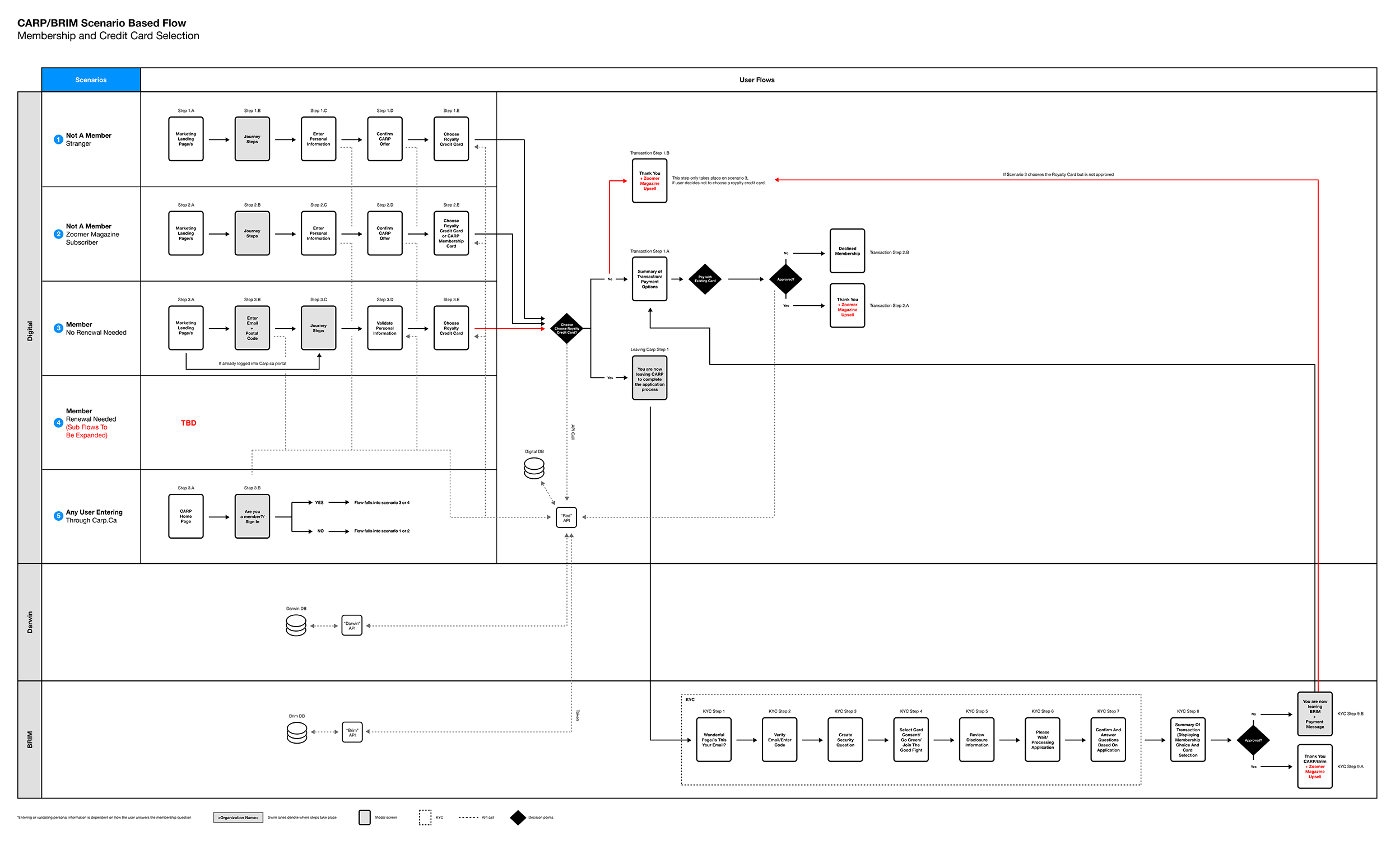
Flow v1
Users were routed via a sign-in/sign-up modal that checked membership status and expiration. Based on their choice, they either continued through C.A.R.P.’s membership flow or were handed off to Brim’s KYC application process.
Flow V2
The final flow simplified the experience significantly: all users followed a unified path regardless of membership status, and we removed membership renewal screens to focus exclusively on credit card conversion.
Wireframes
I explored multiple solutions through sketches before wireframing, guided by one critical question: How do we minimize drop-off at each step?
Strategy:
- Front-load information on the landing page, then streamline subsequent screens
- Limit tasks per screen to one primary action
- Use senior-friendly, concise copy
I wireframed the most complex scenario (member renewal flow) to stress-test the information architecture and ensure every required task had a clear, intuitive home.
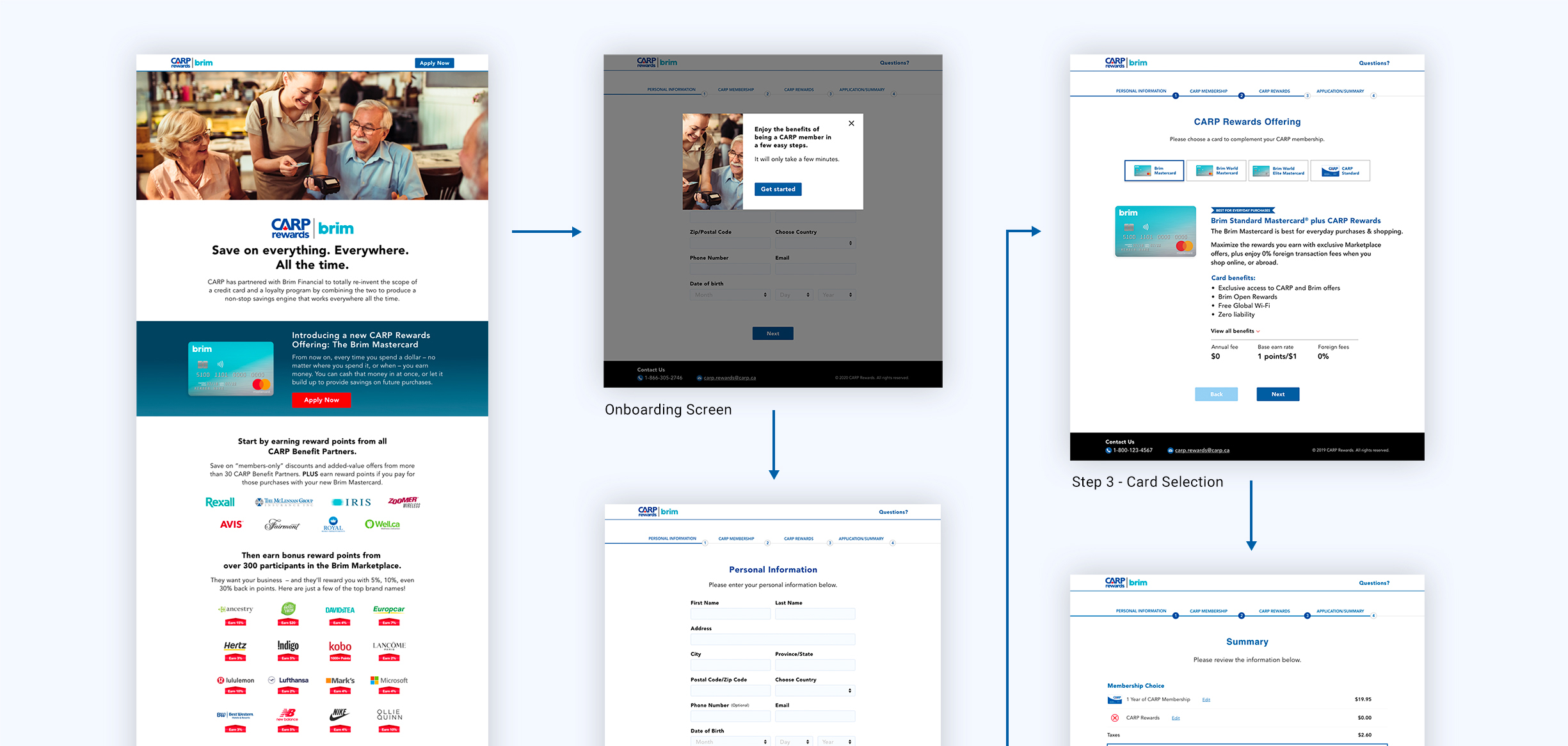
Mockups
Stakeholder pressure to launch required us to skip low-fidelity testing—I moved directly from wireframes to high-fidelity mockups for development, with user testing planned post-launch.
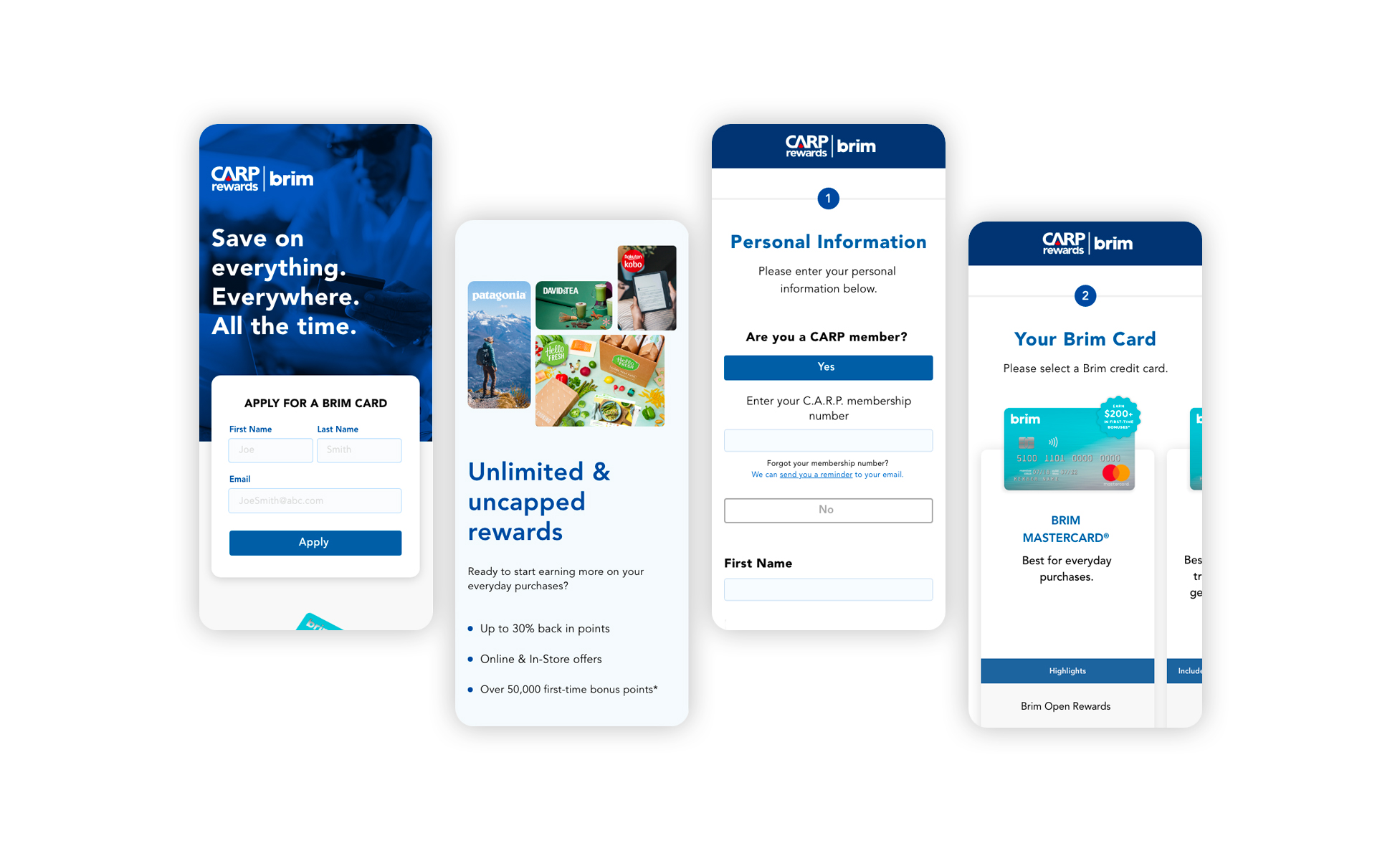
Phase I
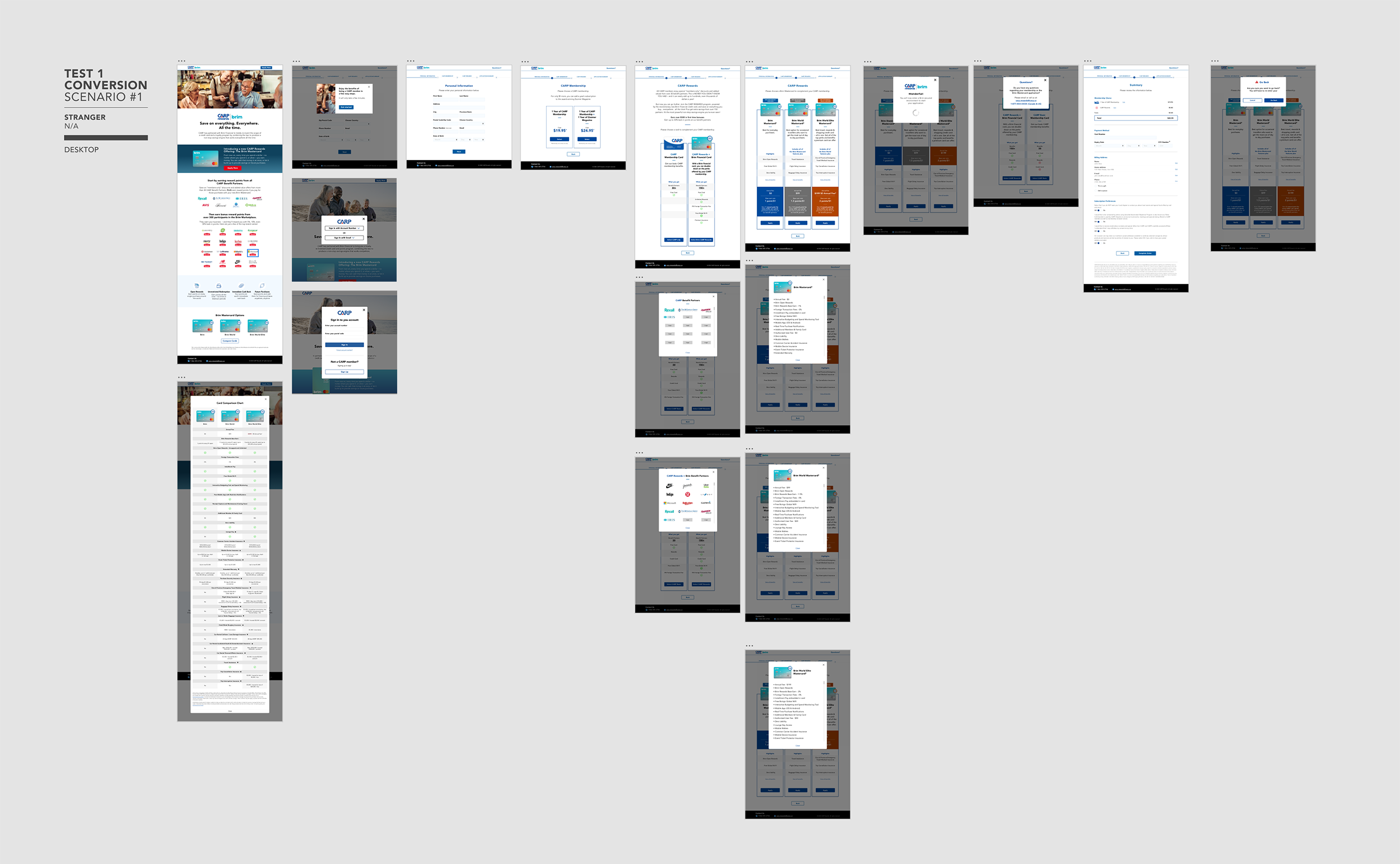
I designed and launched the new member flow (reward.carp.ca). as an internal pilot to validate the platform before scaling.
Phase I - Screens developed for internal testing
Design Handoff and QA process
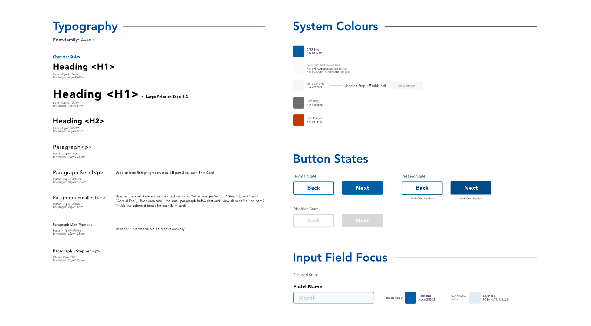
After stakeholder approval, I created a design system including typography, color tokens, button states, and input specifications. I onboarded developers via Zeplin and provided ongoing design support throughout implementation.
I conducted QA across desktop, tablet, and mobile to ensure visual and functional consistency at launch.
User Testing
I recruited 6 ZoomerMedia participants to test the new member conversion flow, focusing on friction points, content clarity, and navigation logic.
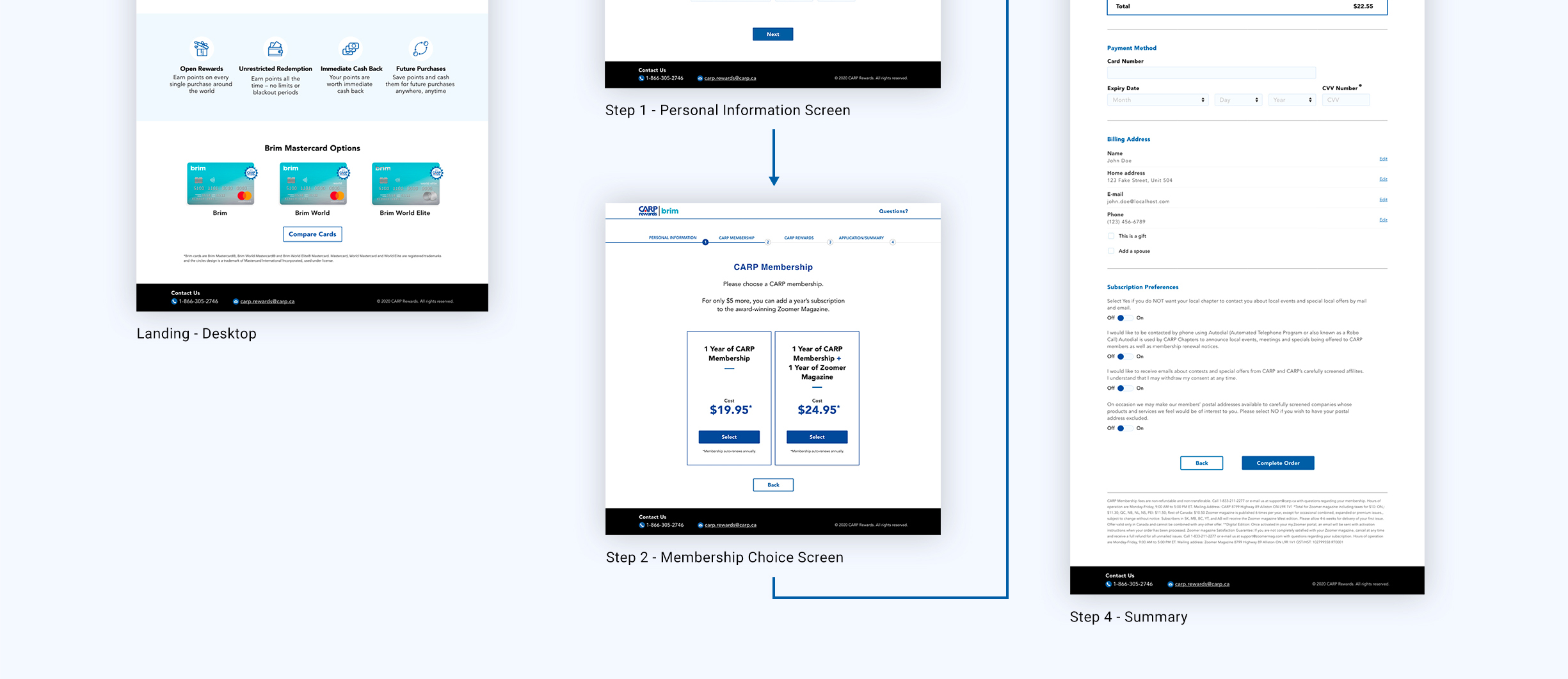
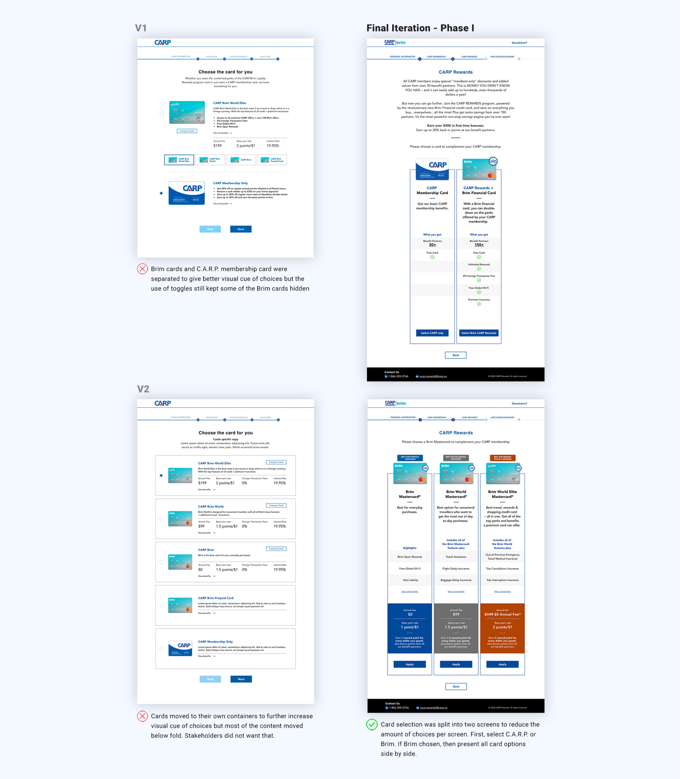
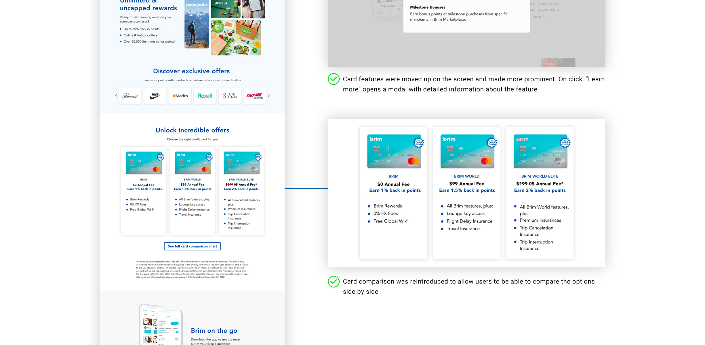
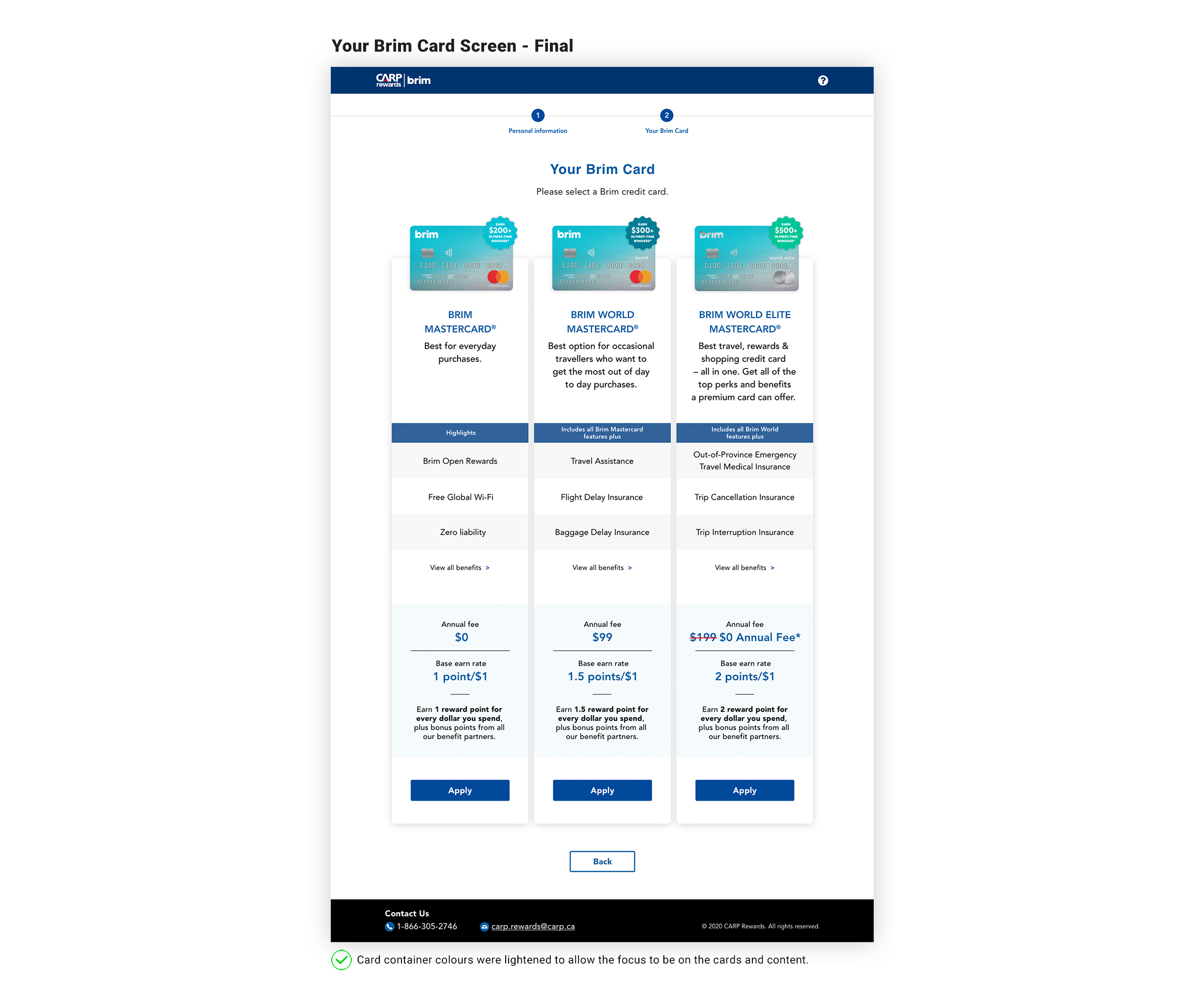
Key Finding: 67% of users missed alternative card options on the selection screen—they didn’t realize cards were stackable above the featured option.
Solution: I designed three layout variations to improve card visibility. After evaluating trade-offs with stakeholders, we implemented a side-by-side comparison view that surfaced all options equally at first glance.
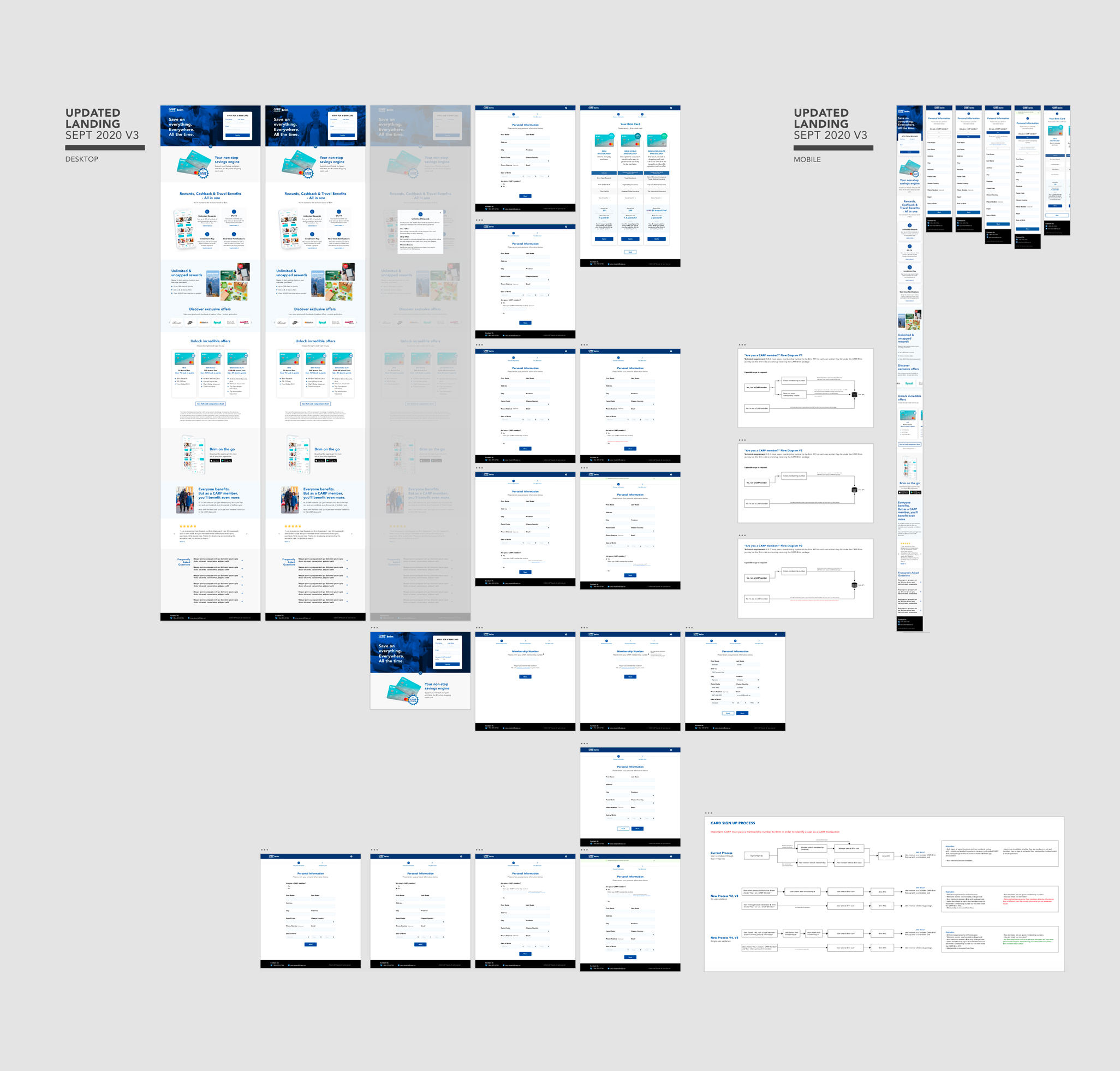
All screens – Phase I
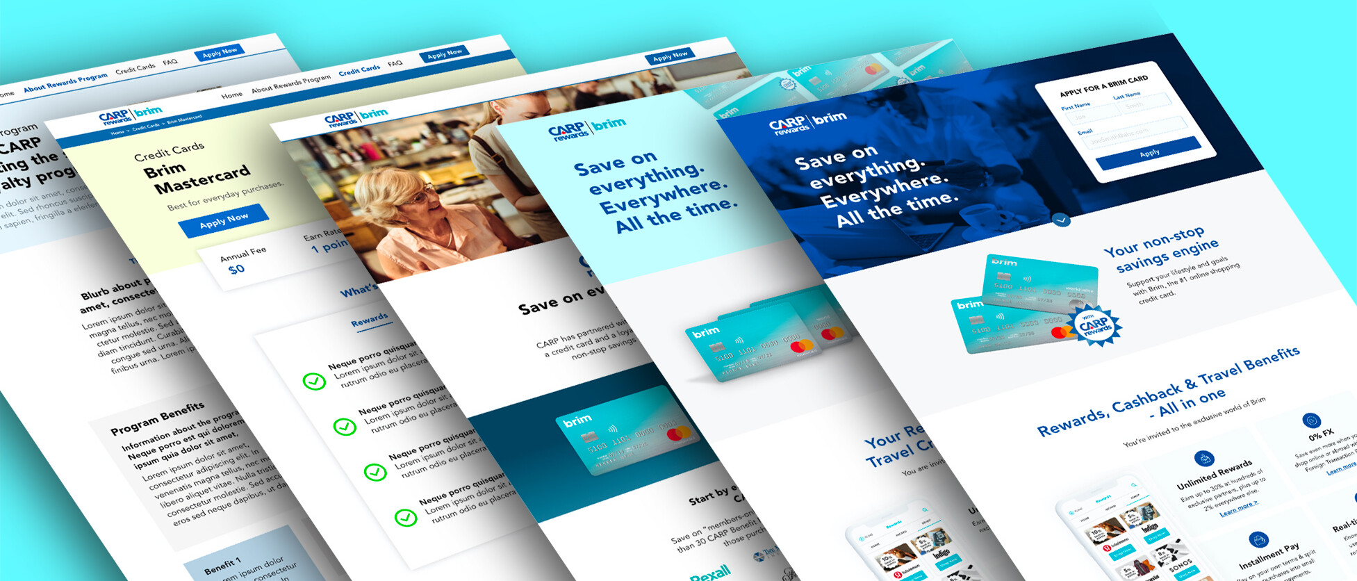
Phase II – Update Marketing Screens
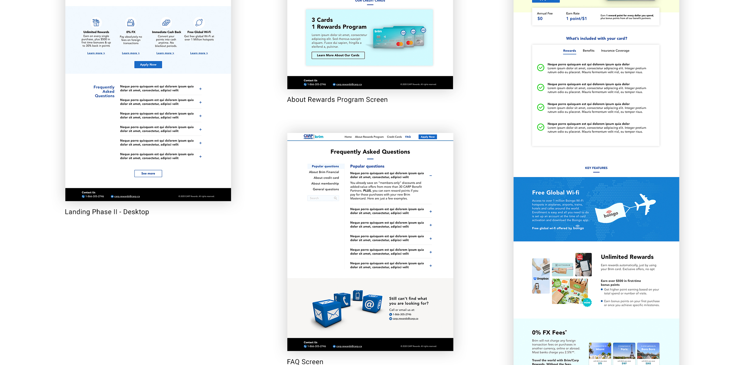
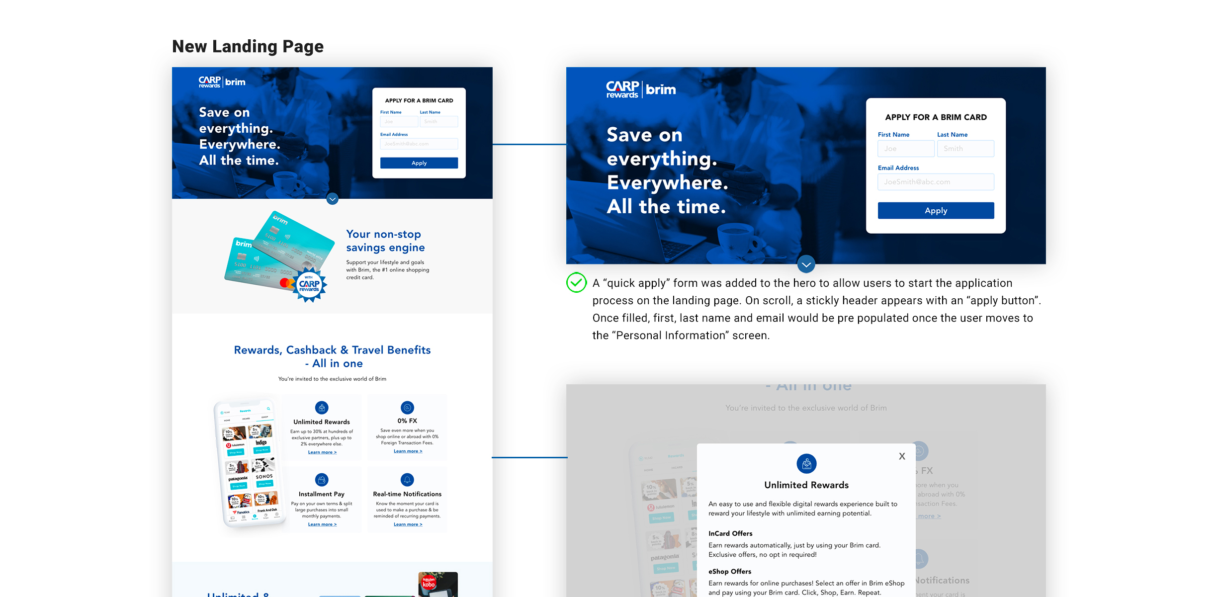
Three months post-launch, conversion rates underperformed despite multi-channel marketing efforts. Without time for user research, I implemented a rapid content enhancement strategy to address potential clarity gaps and build trust.
Solutions Delivered:
- Refreshed landing page with updated messaging, imagery, and FAQ section
- New “About” page clarifying the C.A.R.P.-Brim partnership and benefits
- Individual card detail pages showcasing features and rewards
- Comprehensive FAQ page addressing common objections
These additions aimed to reduce information friction and increase application confidence within tight stakeholder timelines.


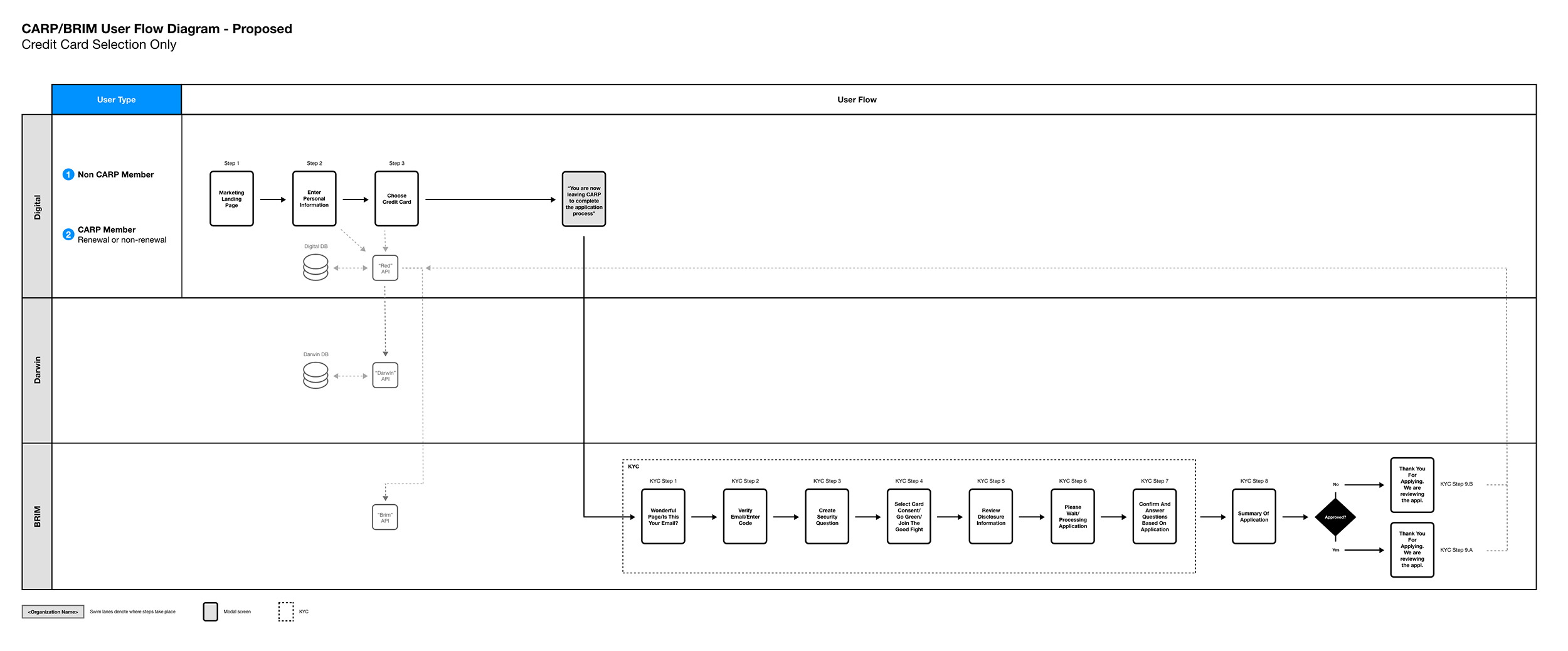
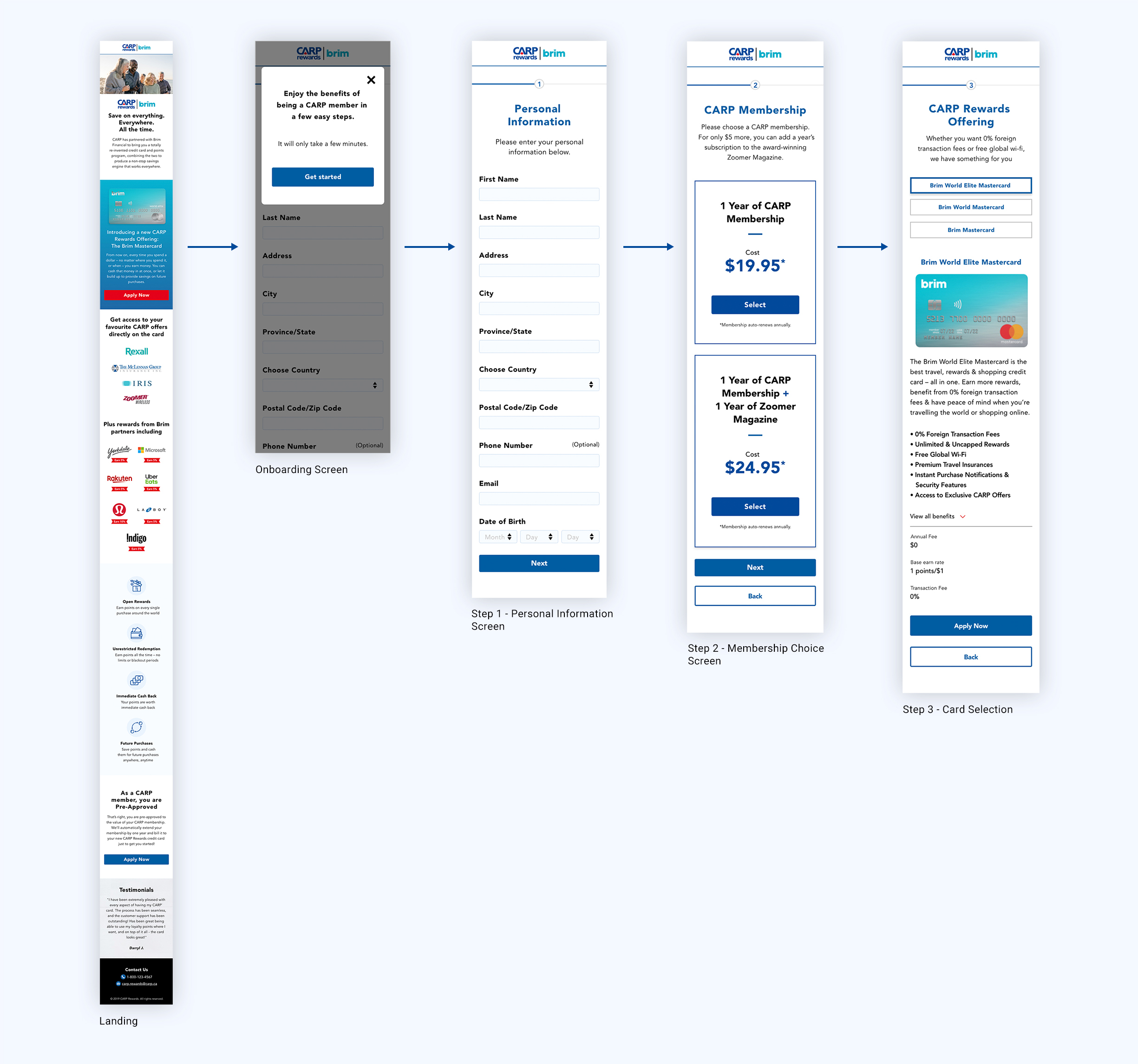
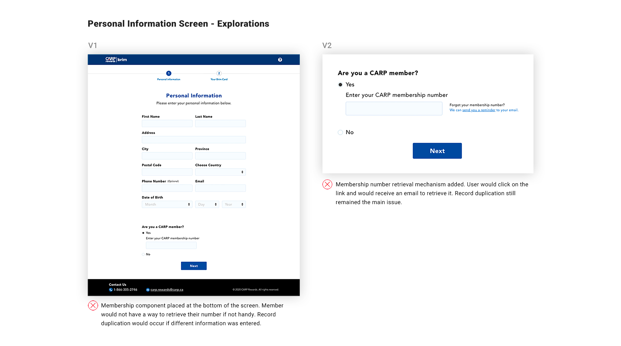
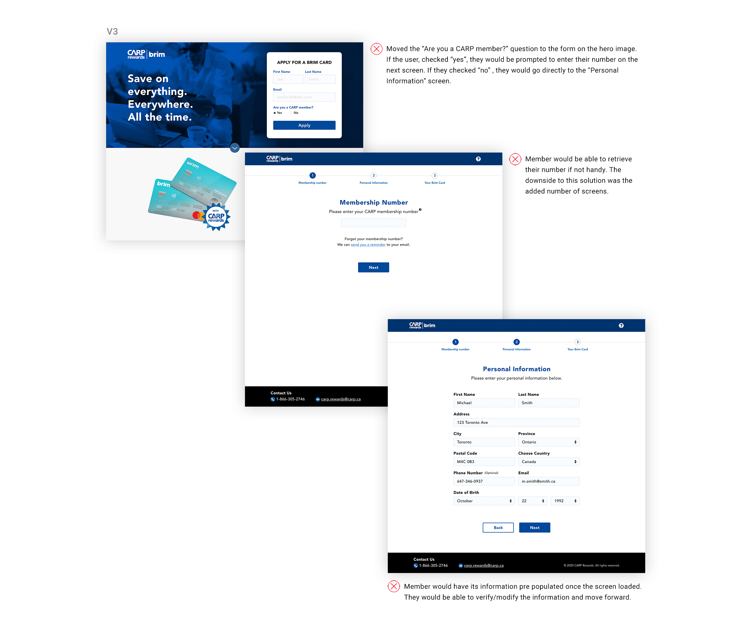
Phase III – Simplify User Flows
Six months of underwhelming performance prompted senior stakeholders to eliminate membership requirements and focus exclusively on credit card conversions. Call center data revealed high friction: members frequently couldn’t locate membership numbers or recall login credentials.
New Requirements: Remove sign-in gates, membership content, and conversion funnels—streamline to card applications only.
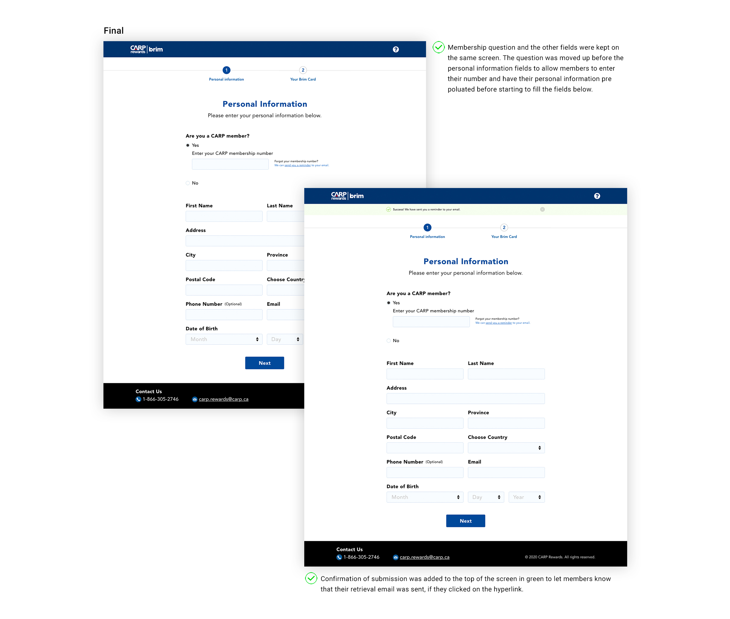
Technical Constraint: The backend required a membership number to trigger the co-branded C.A.R.P./Brim experience. Without it, users defaulted to Brim’s standard application. Solution: retrieve numbers from existing members and auto-generate C.A.R.P. identifiers for new users.
My Approach:
- Redesigned user flows and presented cross-functional implications to stakeholders
- Co-designed the landing page with Brim’s lead product designer to align brand experiences
- Explored “Personal Information” screen variations that balanced membership number collection with minimal friction
- Refreshed visual design to match Brim’s aesthetic, ensuring seamless brand transition
Revised flow
The refined flow created a unified experience: all users followed the same path regardless of membership status, and we eliminated renewal screens to focus solely on credit card conversion.

Interactive Prototype
Akin to the other phases of the project, I created an interactive prototype for three reasons.
- Present a more realistic experience of what the site would look like and how it would behave
- Guide developers on micro interactions
- Test and validate new design
Measuring Success and What is Next
Ten months post-launch, conversion rates remained below targets despite multiple iterations. Root causes remained unclear—potential factors included credit card saturation among seniors, insufficient product differentiation, or pandemic-related hesitancy.
Next Steps: I proposed a data-driven optimization roadmap:
- Deploy targeted surveys to identify specific barriers
- Conduct usability testing on the streamlined flow
- Benchmark performance via Google Analytics and TrialFire heatmaps to quantify improvement